TOPIC
MY PROGRESS
Pug Score
0%
Study Points
+0
Overview
Watch
Read
Next Steps
Back to Menu
Topic Progress
Pug Score
0%
Videos Watched
0/0
Read
Not viewed
Study Points
+0
Overview
Watch
Read
Next Steps
Read
Advantages and disadvantages of different graphs
In this lesson, we will discuss the advantages and disadvantages of using different types of graphs to display data, such as, pictographs, line graphs, and bar graphs.
Question 1:
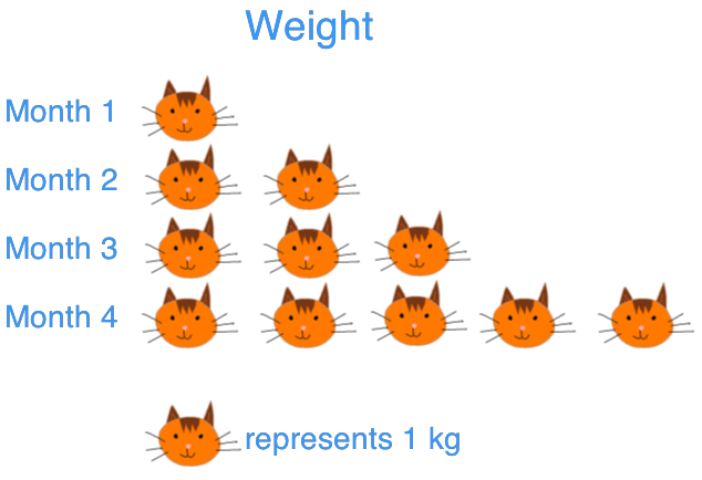
Jane measured the weight of her kitten at the end of every month. She used a pictograph and a line graph to display the data.
|
Month |
1 |
2 |
3 |
4 |
|
Weight (kg) |
1 |
2 |
3 |
5 |
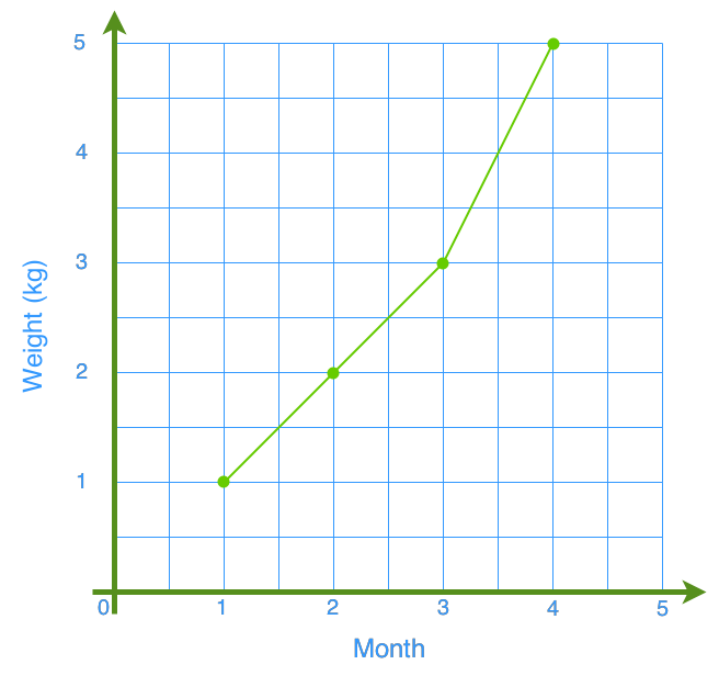
1a) In which two months did the kitten grow at the same rate? Which graph shows this more clearly?
[1,2],[2-3] has the same rate of growth. The line graph is more clear because we can find the rate simply by finding the slope of the line.
1b) Between which two months did the kitten grow the most? Which graph shows this more clearly?
[3,4] does since it has the steepest slope.
1c) Give one advantage and one disadvantage for each month
Line graph:
Advantage: It's better for seeing the rate clearly.
Disadvantage: It's harder to compare.
Pictograph:
Advantage: It is better for finding the weight.
Disadvantage: We are unable to see the data between points.
Question 2
City A
|
Month |
Jan |
Feb |
Mar |
Apr |
May |
Jun |
Jul |
Aug |
Sep |
|
Temperature (°C) |
8 |
9 |
11 |
14 |
17 |
20 |
23 |
23 |
20 |
|
Month |
Jan |
Feb |
Mar |
Apr |
May |
Jun |
Jul |
Aug |
Sep |
|
Temperature (°C) |
9 |
9 |
12 |
18 |
22 |
25 |
27 |
30 |
26 |
2a)
Draw a double bar graph and a double line graph to display the data above.
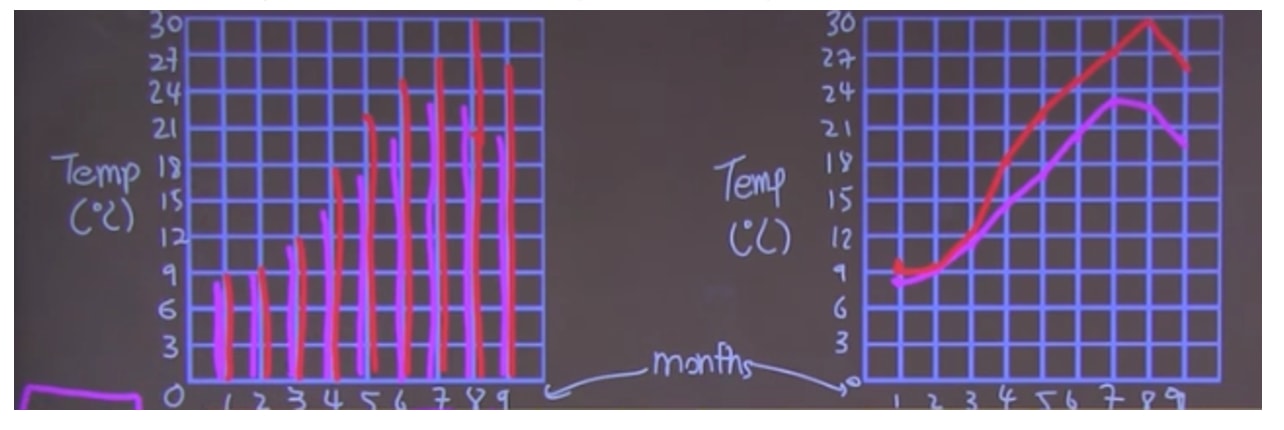
2b) What are the similarities and differences between the trends of temperature change for City A and City B?
Similar: Both increase in temperature until September.
Difference: City B has a higher temperature than City A.
2c) Which graph is able to show the data more clearly? Explain.
Line graph, because of
1) Clear trend
2) Comparable
3) Less distraction
Want more practice problems? Scroll to the bottom of this page to try and figure out which graph will work best for the given situations.