Pie charts
Topic Notes
Introduction to Circle Graphs
Circle graphs, also known as pie charts, are powerful visual tools for representing data in a circular format. Our introduction video provides a comprehensive overview of this essential topic, laying the foundation for a deeper understanding. In this article, we'll explore the art of interpreting and creating circle graphs, equipping you with valuable skills for data analysis. We'll delve into techniques for determining population sizes from percentages, a crucial aspect of working with these charts. Additionally, we'll cover the important process of converting between fractions, percentages, and decimal numbers, which is fundamental to accurately representing data in circle graphs. Whether you're a student, professional, or data enthusiast, mastering circle graphs will enhance your ability to present and analyze information effectively. Join us as we unravel the intricacies of these versatile visual representations and unlock their potential for clear, concise data communication.
Understanding and Interpreting Circle Graphs
Circle graphs, also known as pie charts, are powerful visual tools for representing data proportions and percentages. Learning to interpret these graphs effectively is a valuable skill in data analysis and decision-making. This guide will walk you through the basics of reading circle graphs, helping you quickly grasp the information they convey.
At its core, a circle graph represents a whole (100%) divided into various segments, each depicting a proportion of the total. The size of each segment corresponds to its percentage of the whole. To interpret circle graphs accurately, start by observing the size of each slice relative to the entire circle.
One of the primary advantages of circle graphs is their ability to showcase proportions visually. Larger slices immediately draw attention, representing more significant portions of the data. Conversely, smaller slices indicate lesser proportions. This visual representation allows for quick comparisons between different categories or groups within the data set.
To identify the largest and smallest sections in a circle graph, simply look for the biggest and smallest slices. The largest slice represents the category with the highest percentage or proportion, while the smallest slice indicates the category with the lowest percentage. This quick visual assessment provides immediate insights into the data's distribution.
Understanding percentages is crucial when interpreting circle graphs. Each slice's size corresponds to a specific percentage of the whole. Many circle graphs include labels with exact percentages, making it easier to grasp the precise proportions. When percentages are not provided, you can estimate them by comparing the size of each slice to common fractions like one-quarter (25%), one-third (33%), or one-half (50%) of the circle.
To determine the number of people represented by given percentages in a circle graph, you need to know the total population size. For example, if a circle graph represents a survey of 1000 people and a particular slice shows 25%, that slice represents 250 people (25% of 1000). This calculation is essential for translating percentages into concrete numbers, providing a clearer understanding of the data's real-world implications.
It's important to remember that circle graphs represent proportions of a whole population or dataset. This means that all slices combined always equal 100% of the total. When analyzing a circle graph, consider how each slice relates to the others and to the whole. This perspective helps in understanding the relative importance or frequency of each category within the overall context.
When interpreting circle graphs, pay attention to any color coding or patterns used. Often, similar colors or patterns are used to group related categories, providing additional insights into the data structure. Legends or labels accompanying the graph are crucial for understanding what each slice represents, so always refer to these for accurate interpretation.
Circle graphs are particularly effective for comparing parts to the whole and to each other. They excel at showing how individual components contribute to the overall picture. However, they may become less effective when there are too many categories, as small slices can be difficult to distinguish. In such cases, other chart types might be more appropriate.
To practice interpreting circle graphs, start by estimating percentages without looking at the labels. Then, check your estimates against the actual figures. This exercise will improve your ability to visually assess proportions quickly. Also, try calculating the number of individuals represented by different slices when given a total population size.
In conclusion, mastering the interpretation of circle graphs enhances your data literacy and analytical skills. By understanding how to visually interpret proportions and percentages, quickly identify the largest and smallest sections, and calculate actual numbers from percentages, you'll be better equipped to extract valuable insights from data presented in this format. Remember, circle graphs are about showing parts of a whole, making them an invaluable tool for understanding distributions and proportions across various fields and applications.
Calculating Population Sizes from Circle Graph Data
Understanding how to calculate population sizes from percentages in circle graphs is a valuable skill in data analysis and statistics. This process involves using proportions and cross-multiplication to derive accurate population figures from percentage-based representations. Let's explore this concept in detail, providing step-by-step instructions and examples to illustrate the process.
Step 1: Understand the Circle Graph
Circle graphs, also known as pie charts, represent data as slices of a circular "pie." Each slice corresponds to a percentage of the whole, with all slices adding up to 100%. These percentages are key to calculating population sizes.
Step 2: Set Up the Proportion
To calculate population sizes, we use the following proportion:
Percentage / 100 = Part / Whole
Where:
- Percentage is the given percentage from the circle graph
- 100 represents the total percentage (always 100% for a complete circle)
- Part is the unknown population size for the specific category
- Whole is the total population size
Step 3: Cross-Multiplication
Use cross-multiplication to solve for the unknown part:
(Percentage × Whole) = (Part × 100)
Then, isolate the Part:
Part = (Percentage × Whole) ÷ 100
Example 1: Small Population
Let's say a circle graph shows that 25% of a town's population owns a pet. If the town has 1,000 residents, calculate how many own pets.
Set up the proportion: 25 / 100 = Part / 1,000
Cross-multiply: (25 × 1,000) = (Part × 100)
Solve: Part = (25 × 1,000) ÷ 100 = 250
Therefore, 250 residents own pets.
Example 2: Large Population
A circle graph shows that 12% of a country's population is under 10 years old. If the country has 50 million inhabitants, how many are under 10?
Set up: 12 / 100 = Part / 50,000,000
Cross-multiply: (12 × 50,000,000) = (Part × 100)
Solve: Part = (12 × 50,000,000) ÷ 100 = 6,000,000
Thus, 6 million inhabitants are under 10 years old.
Handling Rounding:
When dealing with large numbers or percentages with decimals, rounding becomes crucial. Generally, round to the nearest whole number for population counts. However, the appropriate level of precision may vary depending on the context and total population size.
For instance, in the country example, rounding to the nearest thousand (6,000,000) might be more appropriate than an exact figure.
Checking Calculations:
To verify your calculations:
- Ensure all category populations sum up to the total population.
- Convert calculated populations back to percentages and compare with the original circle graph.
- Use a calculator or spreadsheet for complex calculations to minimize errors.
Practice Exercise:
A circle graph shows the distribution of eye colors in a school:
- Brown: 45%
- Blue: 30%
- Green: 15%
-
Converting Between Fractions, Percentages, and Decimals
Understanding the process of converting between fractions, percentages, and decimals is crucial when working with circle graphs, also known as pie charts. These conversions play a vital role in accurately interpreting and creating visual representations of data. Let's explore this process and its importance in the context of circle graphs.
Fractions, percentages, and decimals are different ways to express parts of a whole. In circle graphs, these representations help us understand the proportion of each category within the total data set. The ability to convert between these forms allows for easier calculations and clearer communication of information.
To convert a fraction to a percentage, multiply the fraction by 100 and add the percent symbol. For example, 1/4 becomes 25%. To convert a fraction to a decimal, divide the numerator by the denominator. So, 1/4 equals 0.25. Converting from a percentage to a decimal involves dividing by 100, while moving from a decimal to a percentage requires multiplying by 100 and adding the percent symbol.
When working with circle graphs, these conversions become essential in filling out data tables accurately. A typical data table for a circle graph might include columns for the category, frequency, fraction, decimal, percentage, and degree measure. Let's consider an example:
Imagine a survey of 200 people's favorite colors. The results show: 80 prefer blue, 60 like red, 40 choose green, and 20 favor yellow. To fill in the data table, we would start by calculating the fractions: 80/200 for blue, 60/200 for red, and so on. These fractions can then be converted to decimals and percentages. For blue, 80/200 = 0.4 or 40%. For red, 60/200 = 0.3 or 30%. Green would be 40/200 = 0.2 or 20%, and yellow 20/200 = 0.1 or 10%.
The importance of these conversions in interpreting circle graphs cannot be overstated. Percentages, in particular, provide an intuitive understanding of the data distribution. When we see that 40% of respondents prefer blue, we can quickly grasp that it's the most popular color, representing nearly half of all responses. Decimals, on the other hand, are useful for precise calculations, especially when determining the degree measure for each sector of the circle graph.
To calculate the degree measure, we multiply the decimal representation by 360° (the total degrees in a circle). For our color preference example, blue would occupy 0.4 × 360° = 144°, red 108°, green 72°, and yellow 36°. These calculations ensure that the circle graph accurately represents the data proportions visually.
When creating circle graphs, these conversions help in determining the size of each sector and labeling it appropriately. Percentages are often used for labeling as they provide a clear, relatable representation of the data. For instance, it's more intuitive to label a sector as "40% Blue" rather than "0.4 Blue" or "144° Blue".
Moreover, the ability to convert between these forms allows for flexibility in data presentation. Depending on the audience or the specific requirements of a report, you might need to present the same information in different formats. Being proficient in these conversions ensures that you can adapt your data presentation as needed.
In conclusion, mastering the conversions between fractions, percentages, and decimals is a fundamental skill for working with circle graphs. It enables accurate data table completion, precise sector calculations, and clear data interpretation. By understanding these relationships, you can effectively create, read, and analyze circle graphs, making complex data sets more accessible and meaningful to a wider audience.
Creating Circle Graphs from Data
Circle graphs, also known as pie charts, are powerful visual tools for representing data in a clear and concise manner. Creating accurate circle graphs requires attention to detail and a systematic approach. This guide will walk you through the process of creating circle graphs from given data, focusing on calculating sector angles, using a protractor, and drawing accurate sectors.
To begin, you'll need to calculate the sector angles for each data point. This is a crucial step in creating an accurate circle graph. Start by adding up all the values in your data set to get the total. Then, for each individual value, divide it by the total and multiply by 360 degrees. This calculation will give you the angle for each sector in your circle graph.
For example, if you have a data set with values of 25, 40, and 35, the total would be 100. To calculate the angle for the first value (25), you would divide 25 by 100 and multiply by 360, resulting in 90 degrees. Repeat this process for each value in your data set.
Once you have calculated all the sector angles, it's time to use a protractor to draw your circle graph. Begin by drawing a circle on your paper using a compass. Then, draw a straight line from the center of the circle to the edge, which will serve as your starting point. Place the center of the protractor on the center of your circle, aligning the 0-degree mark with your starting line.
Using the calculated angles, mark off each sector on your circle. For instance, if your first sector is 90 degrees, make a mark at the 90-degree point on your protractor. Draw a line from the center of the circle to this mark. Continue this process for each sector, always measuring from your original starting line.
When drawing the sectors, it's essential to be as precise as possible. Small errors in measurement can compound, leading to inaccuracies in your final graph. Take your time and double-check your measurements as you go. If you're using a pencil, you can make light marks initially and darken them once you've confirmed their accuracy.
Labeling your circle graph is an important step that shouldn't be overlooked. Each sector should be clearly labeled with its corresponding data point and percentage. You can do this by drawing lines from the center of each sector to the outside of the circle, extending them slightly beyond the circle's edge. At the end of these lines, write the label and percentage for each sector.
To make your graph more visually appealing and easier to read, consider using different colors or patterns for each sector. This can help distinguish between different data points, especially when you have many sectors or when some sectors are quite small.
As you create your circle graph, be aware of common mistakes to avoid. One frequent error is miscalculating sector angles, which can throw off the entire graph. Always double-check your calculations before drawing. Another mistake is not starting each new sector measurement from the original starting line, which can lead to cumulative errors.
It's also important to ensure that your sectors add up to exactly 360 degrees. If they don't, there's likely an error in your calculations or measurements. Take the time to review your work and make adjustments as necessary.
Remember that the goal of a circle graph is to present data clearly and accurately. Avoid the temptation to exaggerate or minimize certain sectors for visual effect, as this can misrepresent your data. Stick to the calculated angles to ensure your graph is a true representation of the information.
In conclusion, creating accurate circle graphs from data requires careful calculation, precise measurement, and attention to detail. By following these steps and being mindful of potential pitfalls, you can create clear, informative circle graphs that effectively communicate your data. Remember to calculate sector angles accurately, use your protractor with care, draw sectors precisely, and label your graph clearly. With practice, you'll become proficient at creating circle graphs that are both visually appealing and mathematically accurate.
Advanced Techniques and Applications of Circle Graphs
Circle graphs, also known as pie charts, are powerful tools for data visualization. As we delve into advanced techniques, we can unlock their full potential in various fields. One such technique involves comparing multiple datasets using concentric circle graphs. This method allows for a clear visual representation of different categories across multiple sets of data, making it easier to spot trends and patterns.
In real-world applications, circle graphs find extensive use in business analytics, market research, and financial planning. For instance, investment portfolios often utilize circle graphs to display asset allocation, helping investors quickly grasp their diversification strategy. In the healthcare sector, circle graphs can illustrate patient demographics, disease prevalence, or treatment outcomes, aiding in resource allocation and policy-making.
Another advanced technique is the use of interactive circle graphs in digital platforms. These allow users to hover over or click on segments to reveal more detailed information, enhancing user engagement and data exploration. This interactivity is particularly valuable in educational settings and data-driven presentations.
Complex problems that can be solved using circle graph analysis include market segmentation in marketing strategies. By visualizing customer segments based on various attributes, businesses can tailor their approaches more effectively. In environmental studies, circle graphs can represent the composition of ecosystems, helping researchers understand biodiversity and the impact of human activities.
The field of social network analysis also benefits from circle graph techniques. Researchers can use these graphs to represent relationships and connections within communities, revealing key influencers and communication patterns. This application extends to fields like criminology, where circle graphs can map criminal networks and aid in investigation strategies.
In the realm of project management, advanced circle graphs can display resource allocation, task completion status, and time distribution. This visual representation helps project managers identify bottlenecks and optimize workflows. Similarly, in quality control processes, circle graphs can illustrate defect types and frequencies, guiding improvement efforts in manufacturing and service industries.
As we continue to explore advanced techniques, the integration of machine learning with circle graph analysis opens up new possibilities. Predictive models can generate dynamic circle graphs that forecast future trends based on historical data, providing valuable insights for strategic planning across various sectors.
Conclusion
In this article, we've explored the essential aspects of circle graphs, focusing on how to interpret and create them effectively. The introduction video provided a crucial foundation for understanding these visual representations of data. We've learned that circle graphs, also known as pie charts, are excellent tools for displaying proportional relationships within a whole. Key points covered include reading percentages, comparing segments, and identifying the largest and smallest categories. When creating circle graphs, we emphasized the importance of accurate calculations and clear labeling. To truly master this skill, practice is vital. We encourage you to work with various datasets, creating and interpreting circle graphs on your own. For further engagement, try solving sample problems or explore related topics such as bar graphs or line charts. By honing your skills with circle graphs, you'll enhance your ability to analyze and present data effectively in various academic and professional contexts.
Circle Graphs: Analyzing Student Activities
The circle graph shows the types of activities that 200 students participated in during the school year.
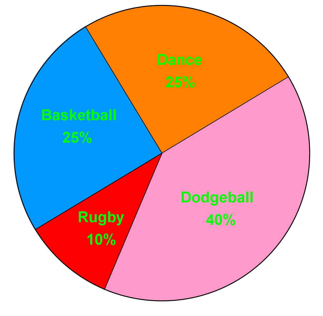
What is the least popular activity?
Step 1: Understanding the Circle Graph
To begin with, it's essential to understand what a circle graph (or pie chart) represents. A circle graph is a circular chart divided into sectors, each sector representing a proportion of the whole. In this case, the circle graph shows the types of activities that 200 students participated in during the school year. Each sector of the circle graph is labeled with an activity and a percentage that indicates the proportion of students who participated in that activity.
Step 2: Identifying the Question
The question asks us to determine the least popular activity among the students. This means we need to find the activity that the smallest percentage of students participated in. In other words, we are looking for the smallest sector in the circle graph.
Step 3: Analyzing the Sectors
To find the least popular activity, we need to carefully examine each sector of the circle graph. Each sector is represented by a different color and labeled with the activity and its corresponding percentage. By comparing the sizes of the sectors, we can identify which one is the smallest.
Step 4: Comparing Percentages
Next, we compare the percentages of each activity. The activity with the smallest percentage is the least popular. In the provided circle graph, the activities and their percentages are as follows:
- Basketball: 25%
- Soccer: 25%
- Swimming: 40%
- Rugby: 10%
Step 5: Verifying the Smallest Sector
To ensure accuracy, we should verify that the sector representing rugby is indeed the smallest. Visually inspect the circle graph to confirm that the sector for rugby is smaller than the sectors for basketball, soccer, and swimming. This visual confirmation supports our conclusion based on the percentages.
Step 6: Drawing the Conclusion
After analyzing the circle graph and comparing the percentages, we can conclude that the least popular activity among the students is rugby, as it has the smallest sector and the lowest percentage (10%). This step-by-step approach ensures that we accurately identify the least popular activity based on the data presented in the circle graph.
FAQs
Here are some frequently asked questions about circle graphs:
1. What are the different types of circular graphs?
The main types of circular graphs include pie charts, doughnut charts, sunburst charts, and polar area diagrams. Each type serves different purposes in data visualization, with pie charts being the most common for showing proportions of a whole.
2. How do you describe a circle on a graph?
A circle on a graph is described by its center point (h, k) and its radius r. The equation of a circle is (x - h)² + (y - k)² = r², where (x, y) represents any point on the circle's circumference.
3. What does the circle graph tell us?
A circle graph, or pie chart, tells us the proportional relationship between parts of a whole. It visually represents how different categories contribute to the total, making it easy to compare relative sizes of various segments.
4. How do you represent data in a circle graph?
To represent data in a circle graph, convert each category's value to a percentage of the total. Then, multiply each percentage by 360° to determine the angle for each sector. Draw these sectors in the circle, with the size of each slice proportional to its percentage.
5. What are the rules for the graph of a circle?
The rules for graphing a circle include: 1) Identify the center point (h, k), 2) Determine the radius r, 3) Plot points r units away from the center in all directions, 4) Connect these points to form a smooth circular shape. The circle should be symmetrical about its center point.
Prerequisite Topics
Understanding the foundational concepts that lead to mastering circle graphs is crucial for students aiming to excel in data visualization and statistical analysis. One of the most important prerequisite topics for circle graphs is using the sine ratio to calculate angles and sides. This fundamental trigonometric concept plays a pivotal role in constructing and interpreting circle graphs accurately.
Circle graphs, also known as pie charts, are visual representations of data that divide a circle into sectors, with each sector's size proportional to the quantity it represents. The ability to calculate sector angles is essential for creating these graphs, and this is where trigonometry, specifically the sine ratio, comes into play.
When working with circle graphs, students need to understand how to convert percentages or fractions of data into angles. This process involves calculating sector angles using trigonometric principles. The sine ratio, expressed as Sin = opposite / hypotenuse, is a fundamental tool in this calculation.
By mastering the use of the sine ratio, students can accurately determine the central angle of each sector in a circle graph. This skill is crucial because the precision of these angles directly affects the visual representation of the data. Inaccurate calculations can lead to misrepresentation of information and potentially flawed analysis.
Moreover, understanding the sine ratio and its application in calculating angles provides students with a deeper insight into the geometric principles underlying circle graphs. This knowledge enhances their ability to interpret and analyze data presented in this format, a skill that is invaluable in various fields such as statistics, economics, and social sciences.
The connection between trigonometry and circle graphs extends beyond mere calculations. It fosters a holistic understanding of mathematical concepts and their real-world applications. Students who grasp the relationship between sine ratios and sector angles are better equipped to tackle more complex data visualization challenges and to critically analyze information presented in circular formats.
In conclusion, the importance of understanding prerequisite topics like using the sine ratio to calculate angles and sides cannot be overstated when it comes to mastering circle graphs. This foundational knowledge not only enables students to create accurate and meaningful visual representations of data but also enhances their overall mathematical reasoning and analytical skills. As students progress in their studies and careers, the ability to work confidently with circle graphs, grounded in a solid understanding of trigonometric principles, will prove to be an invaluable asset.