Reading and drawing line graphs
Topic Notes
Introduction to Reading Line Graphs
Welcome to our lesson on reading line graphs, an essential skill in data visualization! Line graphs are powerful tools for displaying trends and changes over time. Our introduction video is a great starting point to grasp the basics. It covers key elements like the x-axis, y-axis, and data points, making complex information easy to understand. As your math tutor, I'm excited to guide you through this topic. Line graphs are used in various fields, from science to business, so mastering them will be incredibly valuable. We'll explore how to interpret slopes, identify patterns, and draw conclusions from the data presented. Remember, practice makes perfect! After watching the video, we'll dive deeper into real-world examples and exercises to sharpen your skills. Let's embark on this journey to become line graph experts together!
Understanding Line Graph Components
Line graphs are powerful tools for visualizing data trends over time or comparing different variables. To effectively interpret these graphs, it's crucial to understand their basic components. Let's dive into the key elements that make up a line graph and learn how to read them.
First, let's talk about the x-axis. This is the horizontal line at the bottom of the graph. The x-axis typically represents the independent variable, often time or categories. For example, if you're looking at a graph showing temperature changes over a week, the x-axis might display the days of the week. It's important to always check the x-axis labels to understand what's being measured.
Next, we have the y-axis, which is the vertical line on the left side of the graph. The y-axis represents the dependent variable or the quantity being measured. In our temperature example, the y-axis would show the temperature values. Pay attention to the scale on the y-axis, as it can significantly affect how you interpret the data.
Now, let's focus on data points. These are the individual markers on the graph that represent specific measurements. Each data point corresponds to a value on both the x-axis and y-axis. In our temperature graph, a data point might show that on Tuesday (x-axis), the temperature was 75°F (y-axis).
The lines in a line graph connect these data points, showing the relationship or trend between them. The slope of the line indicates how quickly the values are changing. A steep line suggests rapid change, while a more gradual slope indicates slower change. Sometimes, you might see multiple lines on a single graph, each representing a different set of data for comparison.
To interpret a line graph effectively, start by examining the title and axis labels to understand what's being measured. Then, look at the overall trend of the line(s). Is it going up, down, or staying relatively flat? Next, identify any peaks, valleys, or unusual patterns in the data. These can often highlight important events or changes.
Let's consider another example to illustrate these components. Imagine a line graph showing the number of visitors to a website over a month. The x-axis would display the dates, while the y-axis shows the number of visitors. Data points might appear for each day, and the line connecting them would reveal trends in website traffic. You might notice spikes on certain days, perhaps corresponding to marketing campaigns or popular content releases.
When comparing multiple lines on a graph, pay attention to where they intersect or diverge. These points often indicate significant changes or relationships between the variables being compared. For instance, if you're looking at a graph comparing sales of different products over time, crossing lines might show when one product overtook another in popularity.
Remember, the scale of the axes can dramatically affect how the data appears. A compressed y-axis can make small changes look more significant, while an expanded one might make large changes seem less dramatic. Always check the scale to avoid misinterpretation.
By understanding these basic components - the x-axis, y-axis, data points, and lines - you'll be well-equipped to read and interpret line graphs effectively. Practice by analyzing graphs you encounter in daily life, from news articles to work presentations. The more you familiarize yourself with these elements, the more insights you'll be able to glean from visual data representations.
Interpreting Data Points and Trends
Understanding how to read individual data points on a line graph and identify trends is a crucial skill in data interpretation. Line graphs are powerful tools for visualizing changes over time or comparing different variables. By mastering the art of reading these graphs, you can gain valuable insights and make informed decisions based on the data presented.
To begin, let's focus on how to read individual data points. Each point on a line graph represents a specific value at a particular moment or for a specific category. The horizontal axis (x-axis) typically shows the independent variable, such as time or categories, while the vertical axis (y-axis) displays the dependent variable or the measured values. To read a data point, locate its position on both axes and determine its corresponding values.
For example, if you're looking at a graph showing monthly sales, a data point might be positioned at the intersection of "March" on the x-axis and "$50,000" on the y-axis. This tells you that in March, the sales figure was $50,000.
Once you can accurately read individual data points, the next step is to identify trends. Trends are patterns or tendencies that emerge when you look at the data as a whole. There are three main types of trends you'll encounter: rising, falling, and stable.
A rising trend, also known as an upward or positive trend, occurs when the overall direction of the data points moves upward from left to right. This indicates an increase in the measured variable over time or across categories. For instance, a company's revenue graph showing consistent growth over several years would display a rising trend.
Conversely, a falling trend, also called a downward or negative trend, is characterized by data points that generally move downward from left to right. This suggests a decrease in the measured variable. An example could be a graph depicting a decline in air pollution levels in a city over time.
A stable trend, sometimes referred to as a flat or horizontal trend, occurs when data points remain relatively constant, with minimal fluctuations up or down. This indicates little change in the measured variable over the period or across categories. For example, a graph showing steady unemployment rates over several months would display a stable trend.
It's important to note that real-world data often contains a mix of these trend types, and there may be short-term fluctuations within a larger trend. Identifying the overall trend requires looking at the big picture and not getting too focused on individual data points.
Another crucial concept in data interpretation is interpolation. Interpolation is the process of estimating values between known data points. This is particularly useful when you need to approximate a value for a point that falls between two measured data points on your graph.
To interpolate, you can visually estimate the value by looking at the position of the desired point relative to the known data points. For more precise interpolation, you can use mathematical methods such as linear interpolation, which assumes a straight line between two adjacent points.
For example, if you have sales data for January ($100,000) and March ($120,000), but need to estimate February's sales, you could use interpolation. Visually, you might estimate February's sales to be around $110,000 by finding the midpoint between the January and March data points.
As you practice reading line graphs and identifying trends, remember that context is key. Always consider the scales used on both axes, any labels or legends provided, and the overall timeframe or categories represented. This contextual information will help you interpret the data accurately and draw meaningful conclusions.
By honing your skills in data interpretation, trend identification, and interpolation, you'll be better equipped to analyze and understand complex information presented in line graphs. These abilities are invaluable in various fields, from business and finance to science and social studies, enabling you to make data-driven decisions and communicate insights effectively.
Analyzing Multiple Lines and Comparisons
Reading and comparing multiple lines on a single graph is a crucial skill in data analysis. This technique allows us to identify relationships between different data sets and draw meaningful conclusions. When faced with a graph containing multiple lines, it's essential to approach the analysis systematically to extract valuable insights.
To begin, start by examining the graph's overall structure. Take note of the x and y axes, their labels, and the units of measurement. This provides context for the data being presented. Next, focus on each line individually, observing its general trend, peaks, and troughs. Pay attention to the color or pattern used for each line, as these often correspond to specific data sets or variables in the legend.
When comparing multiple lines, look for patterns and relationships between them. Are the lines moving in similar directions, or do they show opposite trends? Do they intersect at any points? These observations can reveal correlations or inverse relationships between different data sets. For example, in a graph showing sales and marketing expenses over time, you might notice that as marketing expenses increase, sales tend to follow suit after a short delay.
One effective technique for identifying relationships in graphs is to focus on specific time periods or data points. Look for instances where one line shows a significant change and observe how the other lines behave during the same period. This can help you spot cause-and-effect relationships or time-lagged correlations between variables.
Another useful approach is to compare the slopes of different lines. A steeper slope indicates a faster rate of change, while a gentler slope suggests a slower rate. By comparing slopes, you can determine which variables are changing more rapidly relative to others. This is particularly valuable when analyzing growth rates or performance metrics across different categories or time periods.
Pay attention to any anomalies or outliers in the data. These could be points where one line deviates significantly from its general trend or where the relationship between lines suddenly changes. Such anomalies often warrant further investigation and may reveal important events or factors influencing the data.
When drawing conclusions from these comparisons, it's crucial to consider the context of the data and any external factors that might influence the relationships observed. For instance, in a graph showing website traffic and conversion rates, a sudden spike in traffic without a corresponding increase in conversions might indicate a successful marketing campaign that attracted visitors who weren't necessarily ready to make a purchase.
To illustrate these techniques, let's consider a hypothetical example of a graph showing monthly revenue, customer acquisition costs, and customer retention rates for a subscription-based service. By analyzing this graph, we might observe that as customer acquisition costs decrease, there's a corresponding increase in new customers and revenue. However, we might also notice that during periods of rapid customer growth, retention rates tend to dip slightly, suggesting that the company may be struggling to maintain service quality during expansion phases.
Another example could be a graph comparing the stock prices of several companies in the same industry over time. By examining the lines, we might identify which companies tend to lead market trends and which ones follow. We could also spot periods of industry-wide growth or decline and analyze how different companies weathered various economic conditions.
In conclusion, interpreting multi-line graphs is a powerful tool for data analysis. By carefully examining trends, relationships, and anomalies, analysts can uncover valuable insights that inform decision-making and strategy. Remember to approach each graph with a critical eye, considering both the data presented and the broader context in which it exists. With practice, you'll develop the ability to quickly extract meaningful information from complex multi-line graphs, enhancing your data analysis skills and decision-making capabilities.
Common Challenges in Reading Line Graphs
Line graphs are powerful tools for visualizing data trends over time, but many students encounter difficulties when interpreting them. Understanding these graph reading challenges and learning strategies to overcome them is crucial for academic success and data literacy. This section addresses common hurdles students face when reading line graphs and provides practical tips to enhance comprehension.
One of the primary challenges in graph interpretation is misunderstanding scales. Students often struggle with different scale types, such as linear, logarithmic, or broken scales. For instance, a graph with a non-zero baseline can exaggerate trends, leading to misinterpretation. To overcome this, always check the y-axis starting point and increments. Pay close attention to scale breaks, indicated by jagged lines or gaps in the axis. Practice identifying various scale types to become more comfortable with different representations.
Another frequent issue is confusing correlation with causation. When two variables show a similar trend on a line graph, it's tempting to assume one causes the other. However, this is a logical fallacy. Correlation merely indicates a relationship, not causation. To avoid this pitfall, always consider external factors that might influence the data. Look for additional information or context provided with the graph. Ask critical questions about potential confounding variables or alternative explanations for the observed trends.
Interpreting multiple lines on a single graph can also be challenging. Students may find it difficult to track and compare different data sets simultaneously. To address this, use a systematic approach. Start by focusing on one line at a time, noting its overall trend. Then, compare and contrast the lines, looking for points of intersection or divergence. Use the legend to identify each line and its corresponding data set. If the graph is particularly complex, consider sketching a simplified version to highlight key relationships.
Identifying and understanding outliers is another crucial skill in graph reading. Outliers are data points that significantly deviate from the overall trend. While they can sometimes be errors, outliers often provide valuable insights. When encountering outliers, don't immediately dismiss them. Instead, investigate potential reasons for their occurrence and consider how they might affect the overall interpretation of the data.
Time-scale interpretation can also pose difficulties, especially when dealing with non-uniform intervals or different time units across graphs. Always check the x-axis labels carefully to understand the time scale used. Be aware that changes in time intervals can affect the perceived rate of change in the data. When comparing multiple graphs, ensure they use consistent time scales for accurate comparisons.
To improve overall graph reading skills, practice regularly with various types of line graphs. Seek out graphs from different sources and subject areas to broaden your experience. Engage in discussions about graph interpretations with peers or instructors to gain diverse perspectives. Additionally, try creating your own line graphs to better understand the relationship between raw data and visual representation.
By addressing these common challenges and implementing these strategies, students can significantly enhance their ability to read and interpret line graphs accurately. Remember, proficiency in graph reading is a valuable skill that extends beyond academic settings, proving essential in many professional fields and in understanding real-world data presentations.
Real-World Applications of Line Graphs
Line graphs are powerful visual tools used across various fields to represent and analyze data trends over time. These versatile charts find applications in numerous real-world scenarios, making them essential for both professionals and everyday decision-making. Understanding line graphs can provide valuable insights and help individuals make informed choices in various aspects of life.
One of the most common real-world applications of line graphs is in meteorology and climate science. Temperature graphs are widely used to display daily, monthly, or yearly temperature fluctuations. These graphs allow meteorologists to identify patterns, predict weather trends, and communicate climate change impacts to the public. For instance, a line graph showing global temperature changes over decades can effectively illustrate the long-term warming trend associated with climate change.
In the financial sector, line graphs are indispensable for visualizing stock market trends. Investors, analysts, and financial advisors rely on these graphs to track the performance of individual stocks, market indices, and other financial instruments over time. By examining the ups and downs of a stock's price on a line graph, traders can identify patterns, support and resistance levels, and make informed decisions about buying or selling securities. Additionally, line graphs help in comparing the performance of multiple stocks or indices simultaneously, enabling investors to assess relative strengths and weaknesses in their portfolios.
Population growth is another area where line graphs prove extremely useful. Demographers and policymakers use these charts to visualize and analyze population trends at local, national, and global levels. A line graph showing population growth over time can reveal important demographic shifts, such as baby booms, population declines, or the effects of migration. This information is crucial for urban planning, resource allocation, and developing long-term strategies for sustainable development.
Beyond these specific examples, line graphs find applications in numerous other fields. In healthcare, they are used to track patient vital signs, monitor disease outbreaks, or visualize the effectiveness of treatments over time. In business, line graphs help managers analyze sales trends, monitor productivity, and forecast future performance. In education, these graphs are employed to track student progress and identify areas for improvement.
Understanding line graphs can be beneficial in everyday life as well. For instance, individuals can use line graphs to monitor their personal finances, track their fitness progress, or analyze their energy consumption patterns. This knowledge empowers people to make data-driven decisions and set realistic goals for personal improvement.
In various professions, the ability to interpret and create line graphs is a valuable skill. Scientists use these charts to present research findings and identify correlations between variables. Engineers employ line graphs to analyze system performance and optimize processes. Marketing professionals utilize them to track campaign effectiveness and consumer behavior trends. Even in fields like journalism and public policy, the ability to understand and explain line graphs is crucial for effectively communicating complex information to the public.
In conclusion, line graphs are versatile tools with wide-ranging applications in both professional and personal contexts. From tracking temperature changes and stock market trends to analyzing population growth and personal progress, these charts provide a clear and concise way to visualize data over time. By developing the skills to interpret and create line graphs, individuals can enhance their decision-making abilities, improve their understanding of complex trends, and communicate information more effectively in various aspects of life and work.
Practice Exercises and Tips
Ready to sharpen your line graph reading skills? Let's dive into some practice exercises and valuable tips to enhance your graph interpretation abilities. Remember, practice makes perfect, so approach these exercises with enthusiasm and patience.
Practice Exercise 1: Economic Growth
Imagine a line graph showing GDP growth over the past decade for three countries. Study the graph for two minutes, then answer these questions:
- Which country had the highest growth rate in 2015?
- What was the overall trend for each country?
- Were there any significant turning points or anomalies?
Practice Exercise 2: Climate Change Data
Visualize a line graph depicting global temperature changes over the last century. Spend three minutes analyzing it, then consider:
- What was the temperature difference between 1920 and 2020?
- Were there any decades with rapid temperature increases?
- Can you identify any patterns or cycles in the data?
Practice Exercise 3: Social Media Usage
Picture a line graph showing daily active users for different social media platforms over five years. After examining it for four minutes, reflect on:
- Which platform experienced the most growth?
- Were there any platforms that declined in usage?
- Can you spot any correlations between different platforms' trends?
Tips for Effective Graph Reading
- Start with the basics: Always begin by reading the title, axis labels, and legend. This provides crucial context for the data.
- Identify the scale: Pay attention to the units and intervals on both axes to understand the magnitude of changes.
- Look for trends: Observe the overall direction of the lines. Are they increasing, decreasing, or fluctuating?
- Spot patterns: Look for recurring cycles, seasonal variations, or sudden changes that might indicate important events.
- Compare and contrast: If multiple lines are present, analyze how they relate to each other. Are there intersections or divergences?
- Consider the context: Think about external factors that might explain the trends you're seeing.
- Practice estimation: Try to estimate values between marked points on the axes to improve your interpolation skills.
Remember, becoming proficient at reading line graphs takes time and practice. Don't get discouraged if you find some aspects challenging at first. Each graph you analyze helps build your skills and intuition. As you work through these exercises, try to apply the tips mentioned above. You'll soon find yourself naturally picking up on trends and patterns more quickly.
To further enhance your graph reading abilities, consider the following additional strategies:
- Sketch key points or trends on paper to reinforce your observations.
- Verbalize your findings out loud, as if explaining the graph to someone else.
- Challenge yourself with graphs from various fields to broaden your interpretation skills.
- Seek out real-world applications of the data you're analyzing to make connections.
As you continue to practice, you'll develop a keen eye for detail and a deeper understanding of data visualization. Remember, every expert was once a beginner, so keep pushing forward with confidence. Your graph reading skills will improve with each exercise, opening up new insights and opportunities in data analysis and interpretation.
Conclusion
In this article, we've explored the essential elements of line graphs, from their basic components to practical interpretation techniques. We've covered how to identify trends, compare data sets, and extract meaningful insights from these visual representations. The introduction video serves as a crucial foundation, offering a clear and concise overview of line graph fundamentals. Remember, mastering line graphs is a skill that improves with practice. We encourage you to apply these concepts to real-world examples and datasets. As you gain confidence, consider exploring more complex graph types to expand your data visualization repertoire. By honing your ability to read and interpret line graphs, you'll enhance your analytical skills and decision-making capabilities across various fields. Keep practicing, stay curious, and continue to develop your graphical literacy it's an invaluable asset in our data-driven world.
Reading and Drawing Line Graphs
Mrs. K created a graph to keep track of attendance in her classroom over a week.
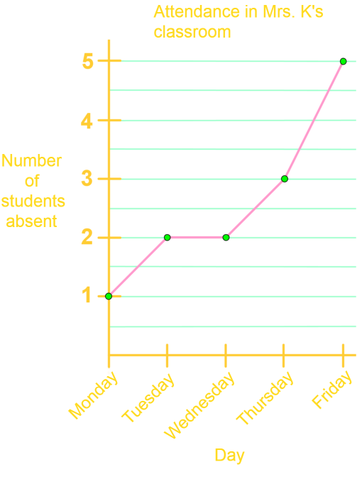
On which days were exactly 2 students absent?
Step 1: Understanding the Graph
First, we need to understand the type of graph presented. This is a line graph, which consists of data points connected by straight lines. Line graphs are used to observe how data changes over time. In this case, the graph shows the number of students absent each day over a week.
Step 2: Identifying the Data Points
Next, we need to identify the data points on the graph. Each point on the graph represents the number of students absent on a particular day. The x-axis represents the days of the week, and the y-axis represents the number of students absent.
Step 3: Analyzing the Data
We need to analyze the data to find out on which days exactly 2 students were absent. We start by looking at the y-axis and finding the value '2'. Then, we trace this value horizontally across the graph to see where it intersects with the data points.
Step 4: Observing the Intersections
By observing the intersections, we can see that the line graph intersects the value '2' on the y-axis at two points. These points correspond to the days on the x-axis. We need to identify these days.
Step 5: Identifying the Days
From the graph, we can see that the line intersects the value '2' on the y-axis on Tuesday and Wednesday. Therefore, exactly 2 students were absent on these two days.
Step 6: Conclusion
In conclusion, by carefully analyzing the line graph, we determined that exactly 2 students were absent on Tuesday and Wednesday. This method can be applied to any similar line graph to find specific data points.
FAQs
Here are some frequently asked questions about reading and understanding line graphs:
1. How do you read a graph for beginners?
To read a graph as a beginner, start by identifying the title and axis labels. Look at the x-axis (horizontal) and y-axis (vertical) to understand what's being measured. Observe the overall trend of the line(s) and note any significant changes or patterns. Pay attention to the scale and units used on both axes.
2. How do you read a line graph for kids?
For kids, explain that a line graph shows how things change over time. Point out that the bottom line (x-axis) usually shows time, while the side line (y-axis) shows the amount of something. Encourage them to follow the line with their finger, noting how it goes up (increases) or down (decreases).
3. How to explain line graph?
Explain that a line graph uses lines to show how data changes over time or across categories. The x-axis typically represents time or categories, while the y-axis shows the measured values. The line connects data points, and its slope indicates the rate of change. Multiple lines can be used to compare different sets of data.
4. How do you read two line graphs?
When reading two line graphs, first identify what each line represents using the legend. Compare the overall trends of both lines. Look for points where the lines intersect or diverge significantly. Pay attention to how each line responds to changes in the x-axis variable. Consider the relationship between the two variables and any potential correlations.
5. What are some common challenges in reading line graphs?
Common challenges include misinterpreting scales, confusing correlation with causation, difficulty comparing multiple lines, identifying outliers, and interpreting non-uniform time intervals. To overcome these, always check axis scales carefully, consider external factors, focus on one line at a time before comparing, investigate outliers, and pay close attention to time intervals on the x-axis.
Prerequisite Topics
Understanding the foundations of mathematics is crucial for mastering more advanced concepts. When it comes to reading and drawing line graphs, one essential prerequisite topic stands out: graphing from slope-intercept form y=mx+b. This fundamental skill is the cornerstone of interpreting and creating line graphs effectively.
The slope-intercept form of a linear equation, y=mx+b, is a powerful tool that directly relates to reading and drawing line graphs. In this equation, 'm' represents the slope of the line, which indicates the rate of change, while 'b' represents the y-intercept, the point where the line crosses the y-axis. Understanding these components is crucial for accurately interpreting and constructing line graphs.
When you grasp the concept of graphing from slope-intercept form, you develop a keen eye for identifying the slope of a line in various contexts. This skill is invaluable when reading line graphs, as it allows you to quickly assess trends and patterns in the data. Whether you're analyzing financial trends, scientific data, or any other information presented in a line graph, your ability to recognize and interpret slopes will greatly enhance your understanding.
Moreover, the y-intercept (b) in the slope-intercept form provides crucial information about the starting point of a line graph. This knowledge is particularly useful when drawing line graphs, as it helps you accurately plot the initial point and establish the graph's foundation. Understanding how to manipulate the y-intercept allows you to shift graphs vertically, a skill that's often required when comparing multiple data sets or adjusting for different baseline values.
The connection between graphing from slope-intercept form and reading and drawing line graphs extends beyond basic interpretation. It enables you to make predictions, extrapolate data, and even reverse-engineer equations from given graphs. These advanced skills are invaluable in fields such as economics, physics, and data science, where line graphs are frequently used to represent complex relationships.
By mastering this prerequisite topic, you'll develop a strong intuition for linear relationships, which is the essence of line graphs. This foundation will not only make reading and drawing line graphs more accessible but also enhance your overall mathematical reasoning. As you progress in your studies, you'll find that this knowledge seamlessly integrates with more advanced graphing techniques and data analysis methods.
In conclusion, investing time in understanding graphing from slope-intercept form is a crucial step towards mastering the art of reading and drawing line graphs. This prerequisite knowledge will empower you to approach line graphs with confidence, whether you're interpreting complex data sets or creating your own visual representations of linear relationships.