Reading and drawing histograms
Topic Notes
Introduction to Reading and Drawing Histograms
Histograms are powerful tools in data visualization, essential for representing continuous data distributions. Unlike bar graphs, which display discrete categories, histograms showcase the frequency of data points within specific intervals or bins. This unique feature makes histograms invaluable for analyzing patterns, identifying outliers, and understanding the shape of data distributions. In our introduction video, we'll explore the fundamentals of histograms and their significance in data analysis. You'll learn how to interpret histogram shapes, such as normal distribution histogram, skewed, or bimodal distributions, and how these shapes reveal crucial information about your dataset. We'll also discuss the key differences between histograms and bar graphs, emphasizing how histograms excel at representing continuous data like heights, weights, or temperatures. By mastering histograms, you'll gain a vital skill for effectively communicating complex data trends and making informed decisions based on data distributions.
Understanding Histograms
A histogram is a powerful graphical tool used to represent the distribution of continuous data. Unlike a bar graph, which typically displays discrete categories, a histogram showcases the frequency of data points falling within specific intervals or "bins." This distinction makes histograms particularly useful for visualizing large datasets and identifying patterns in continuous variables.
The primary purpose of a histogram is to provide a clear visual representation of the shape, central tendency, and spread of a dataset. By grouping data into intervals, histograms offer insights into the underlying distribution, whether it's normal, skewed, or multimodal. This makes them invaluable in fields such as statistics, data science, and various scientific disciplines.
One of the key features of a histogram is its use of intervals or bins. These are contiguous, non-overlapping ranges that divide the entire span of the data. The width of these bins can significantly impact the histogram's appearance and interpretation. Narrower bins provide more detail but may introduce noise, while wider bins offer a smoother representation but might obscure important features.
For example, consider a dataset of employee salaries in a company. A histogram could group these salaries into $10,000 intervals, such as $30,000-$39,999, $40,000-$49,999, and so on. The height of each bar in the histogram would represent the number of employees falling within each salary range, providing a quick visual summary of the salary distribution across the organization.
Another common application of histograms is in educational settings, particularly for analyzing test scores. If a teacher wants to visualize the distribution of scores on a recent exam, they might create a histogram with bins representing score ranges (e.g., 60-69, 70-79, 80-89). This visualization would instantly reveal whether the scores are normally distributed, skewed towards higher or lower scores, or if there are any unusual patterns.
Unlike bar graphs, which typically have gaps between bars to emphasize the discrete nature of the categories, histogram bars are adjacent to each other. This continuous representation reflects the nature of the data being displayed. The area of each bar in a histogram is proportional to the frequency of data points within that interval, making it easy to compare the relative frequencies across different bins.
When creating a histogram, choosing the appropriate number of bins is crucial. Too few bins can oversimplify the data, while too many can create a noisy, difficult-to-interpret graph. Various methods exist for determining the optimal number of bins, including rules of thumb (like the square root of the number of data points) and more sophisticated statistical techniques.
Histograms are particularly effective at revealing outliers, gaps in the data, and multimodal distributions that might not be apparent from summary statistics alone. For instance, a bimodal distribution in test scores might suggest two distinct groups of students with different levels of understanding, prompting further investigation.
In the digital age, histograms have found applications beyond traditional data analysis. They are used in image processing to represent the distribution of pixel intensities, helping in tasks like contrast adjustment and image enhancement. In finance, histograms of stock price changes can reveal volatility patterns and inform trading strategies.
Understanding how to interpret histograms is an essential skill in data literacy. By examining the shape, central tendency, and spread of the distribution, one can gain valuable insights into the underlying data. Whether you're analyzing customer ages, product lifespans, or environmental measurements, histograms provide a powerful tool for visualizing and understanding continuous data distributions.
Reading Histograms
Histograms are powerful visual tools for displaying the distribution of data. Learning how to read histograms effectively is crucial for data interpretation and analysis. This step-by-step guide will help you master the art of reading histograms, understand their components, and extract valuable insights from the data they represent.
Step 1: Understand the Structure
A histogram consists of two main components: the x-axis (horizontal) and the y-axis (vertical). The x-axis represents the data intervals or bins, while the y-axis shows the frequency or count of data points within each interval. Familiarize yourself with these elements before diving deeper into interpretation.
Step 2: Interpret the X-Axis (Intervals)
The x-axis of a histogram is divided into intervals or bins. These intervals represent ranges of values for the variable being measured. To read the x-axis:
- Identify the scale and units used
- Note the width of each interval
- Observe if the intervals are equal in width or vary
Understanding the intervals is crucial for accurate data interpretation and comparison between different ranges.
Step 3: Analyze the Y-Axis (Frequency)
The y-axis displays the frequency or count of data points falling within each interval. To interpret the y-axis:
- Check the scale and units (often representing count or percentage)
- Note the maximum frequency value
- Observe how the frequency varies across different intervals
The height of each bar in the histogram corresponds to the frequency of data points in that specific interval.
Step 4: Determine Data Points in Specific Ranges
To find the number of data points within a specific range:
- Identify the relevant interval(s) on the x-axis
- Locate the corresponding bar(s) in the histogram
- Read the frequency value from the y-axis for each bar
- Sum the frequencies if the range spans multiple intervals
This process allows you to quantify how many data points fall within any given range of values.
Step 5: Compare Different Intervals
Comparing intervals helps identify patterns and trends in the data distribution. To compare intervals:
- Compare the heights of different bars
- Look for peaks (most frequent intervals) and valleys (least frequent intervals)
- Observe if the distribution is symmetric, skewed, or has multiple modes
- Note any outliers or unusual patterns in the data
These comparisons provide insights into the overall shape and characteristics of the data distribution.
Step 6: Interpret the Overall Shape
The shape of a histogram reveals important information about the data distribution:
- Symmetric: Data is evenly distributed around a central value
- Skewed right: Tail extends towards higher values
- Skewed left: Tail extends towards lower values
- Bimodal: Two distinct peaks, suggesting two subgroups in the data
- Uniform: Relatively equal frequency across all intervals
Understanding the shape helps in making inferences about the underlying data and potential factors influencing its distribution.
Examples of Questions Answered Using Histograms
Histograms can answer various questions about data distribution, such as:
- What is the most common range of values?
- How many data points
Creating Histograms: Data Preparation
Preparing data for creating a histogram is a crucial step in data analysis that requires careful consideration and planning. This process involves several key steps, including determining the number of intervals or bins, calculating the range of data, and deciding on interval sizes. By following these steps, you can ensure that your histogram accurately represents your data and provides meaningful insights.
The first step in data preparation is determining the number of intervals or bins for your histogram. This decision significantly impacts the visual representation of your data and can affect the interpretation of results. One popular method for determining the number of bins is the square root method. This approach suggests that the number of bins should be approximately equal to the square root of the total number of data points. For example, if you have 100 data points, you would use approximately 10 bins (100 = 10).
Once you've determined the number of bins, the next step is to calculate the range of your data. The range is the difference between the maximum and minimum values in your dataset. This information is crucial for establishing the boundaries of your histogram and ensuring that all data points are included. To calculate the range, simply subtract the smallest value from the largest value in your dataset.
After determining the range, you need to decide on the interval sizes for your bins. The interval size is typically calculated by dividing the range by the number of bins. For example, if your data range is 100 and you've decided to use 10 bins, each interval would have a size of 10 (100 ÷ 10 = 10). It's important to ensure that your intervals are equal in size to maintain consistency and accuracy in your histogram.
With the number of bins, range, and interval sizes determined, you can now create a frequency table. A frequency table is a crucial tool in histogram creation as it organizes your data into the predetermined intervals and shows how many data points fall into each bin. To create a frequency table, list your intervals in one column and count the number of data points that fall within each interval in another column.
When creating your frequency table, it's important to pay attention to the boundaries of your intervals. You can choose to make your intervals inclusive on one end and exclusive on the other (e.g., 0-10, 10-20, 20-30) or use a midpoint notation (e.g., 5, 15, 25) to represent each interval. Whichever method you choose, be consistent throughout your table to avoid confusion or errors in data representation.
As you prepare your data for histogram creation, keep in mind that the goal is to create a clear and accurate representation of your dataset. Sometimes, you may need to adjust your initial calculations to better fit your data. For instance, if you find that your chosen number of bins results in too many empty intervals or overly crowded bins, you may need to reconsider your bin count or interval sizes.
In conclusion, preparing data for creating a histogram involves careful consideration of several factors. By determining the appropriate number of bins, calculating the data range, deciding on interval sizes, and creating a well-organized frequency table, you can ensure that your histogram accurately represents your data and provides valuable insights. Remember that data preparation is an iterative process, and you may need to make adjustments as you work to find the most effective way to visualize your data.
Drawing Histograms
Drawing histograms is an essential skill for visualizing data distributions. This comprehensive guide will walk you through the process of creating accurate and visually appealing histograms by hand. We'll cover everything from setting up the axes to plotting bars and labeling your graph, with a focus on accuracy and neatness.
To begin drawing a histogram, start by setting up your axes. Use a ruler to draw a horizontal line for the x-axis and a vertical line for the y-axis, ensuring they meet at a right angle. The x-axis typically represents the data categories or intervals, while the y-axis shows the frequency or count of data points in each category.
Next, determine the scale for each axis. For the x-axis, divide it into equal intervals based on your data range. For the y-axis, choose a scale that accommodates the highest frequency in your dataset. Mark these intervals clearly along each axis using small, evenly spaced tick marks.
Now it's time to plot the bars. Each bar in a histogram represents a data category or interval. The width of the bar corresponds to the interval width on the x-axis, while the height represents the frequency or count of data points in that interval. Use your ruler to draw each bar accurately, ensuring they touch each other without gaps between them, as histograms represent continuous data.
Accuracy is crucial when drawing histograms. Always use a ruler to measure and draw straight lines for the axes and bars. This precision not only improves the visual appeal of your histogram but also ensures that the data representation is correct and reliable.
Labeling your graph is an important step in making it informative and easy to understand. Add clear, concise labels to both axes, indicating what each represents. For the x-axis, label the intervals or categories. For the y-axis, label the frequency or count. Include a descriptive title at the top of your histogram that summarizes what the data represents.
To enhance the visual appeal of your histogram, consider shading the bars. Use a consistent shading technique for all bars, such as diagonal lines or a solid color. If using color, choose one that contrasts well with the background for better visibility. Shading not only makes your histogram more attractive but can also help distinguish between different categories if you're comparing multiple datasets on the same graph.
In some cases, you may need to connect the tops of the bars to create a frequency polygon in histograms. This is particularly useful when comparing multiple datasets or highlighting trends. Use a ruler to draw straight lines connecting the midpoints of the top edges of adjacent bars. This line should be distinct from the bars themselves, so consider using a different color or line style.
When drawing histograms with unequal interval widths, it's important to adjust the heights of the bars to maintain accurate representation. In these cases, use the concept of density rather than raw frequency. Calculate the density by dividing the frequency by the interval width, and adjust the bar heights accordingly.
To ensure neatness, take your time and work carefully. Use a sharp pencil for initial sketching, allowing for easy corrections. Once you're satisfied with the accuracy and placement of all elements, you can go over the lines with a pen or marker for a more polished look.
Remember to include a key or legend if you're using different shadings or colors to represent multiple datasets on the same histogram. Place this in a clear, unobtrusive area of your graph, typically in the upper right corner or below the x-axis label.
Practice is key to improving your histogram drawing skills. Start with simple datasets and gradually move to more complex ones. Pay attention to proportions and scaling, as these can significantly impact the interpretation of your data.
In conclusion, drawing histograms by hand is a valuable skill that combines data analysis with visual representation. By following these steps and tips, you'll be able to create accurate, neat, and informative histograms that effectively communicate your data. Remember, the goal is not just to plot data points, but to tell a story with your data through clear and visually appealing graphs.
Analyzing Histograms
Histogram analysis is a powerful tool for gaining insights from data, allowing researchers and analysts to visualize the distribution of a dataset and uncover important patterns. By examining the shape, spread, and central tendency of a histogram, we can extract valuable information about the underlying data.
One of the key aspects of histogram analysis is understanding distribution shapes. The most common shape is the normal distribution, also known as the bell curve. This symmetrical shape indicates that data points are evenly distributed around the mean, with most values clustered in the center and fewer at the extremes. Normal distributions are often found in natural phenomena and are crucial in many statistical analyses.
However, not all data follows a normal distribution. Skewed distributions are another important shape to recognize. Left-skewed (or negatively skewed) histograms have a longer tail on the left side, indicating more low values in the dataset. Right-skewed (or positively skewed) histograms, conversely, have a longer tail on the right, suggesting more high values. Recognizing skewness is essential for understanding the nature of the data and choosing appropriate statistical methods.
Bimodal distributions are characterized by two distinct peaks, indicating two separate subgroups within the data. This shape can reveal important insights about population differences or the presence of two distinct phenomena within a single dataset. Identifying bimodal distributions can lead to further investigation into the underlying causes of the two peaks.
Outliers are another critical element to look for when analyzing histograms. These are data points that fall significantly outside the main distribution and can be easily spotted as isolated bars far from the central cluster. While outliers may sometimes represent errors in data collection, they can also indicate important extreme cases that warrant further investigation.
Comparing multiple histograms side by side can provide valuable insights into differences between groups or changes over time. This technique allows for visual assessment of how distributions differ in terms of central tendency, spread, and shape. When comparing histograms, it's important to ensure that the bin sizes and scales are consistent to avoid misleading comparisons.
In real-world scenarios, histogram analysis finds applications across various fields. In finance, histograms of stock returns can help investors understand the risk profile of different assets. In manufacturing, quality control processes often use histograms to monitor product specifications and identify potential issues in production lines. Environmental scientists may use histograms to analyze pollution levels across different regions or time periods.
Healthcare professionals utilize histograms to analyze patient data, such as blood pressure readings or cholesterol levels, to identify trends and potential health risks in populations. In marketing, histograms can be used to visualize customer demographics or purchasing behaviors, helping businesses tailor their strategies to target specific segments.
To effectively analyze histograms, it's crucial to consider the context of the data and the specific questions being addressed. The choice of bin size can significantly impact the appearance of a histogram and the insights that can be drawn from it. Too few bins may obscure important details, while too many can create noise and make patterns difficult to discern.
Advanced techniques in histogram analysis include using smoothing methods to reduce noise and highlight underlying trends, as well as employing statistical tests to quantify the significance of observed patterns. These methods can enhance the insights gained from histogram analysis and provide a more robust foundation for decision-making.
In conclusion, histogram analysis is a versatile and powerful technique for exploring data distributions and uncovering valuable insights. By understanding distribution shapes, identifying outliers, and comparing multiple histograms, analysts can gain a deeper understanding of their data and make more informed decisions across a wide range of fields and applications.
Conclusion
Understanding histograms is crucial for effective data analysis, especially when dealing with continuous data. Key points to remember include: histograms display frequency distributions, bin width affects interpretation, and they reveal data shape, central tendency, and spread. When reading histograms, focus on the overall shape, identify peaks and gaps, and consider the context of the data. Drawing histograms requires selecting appropriate bin sizes and ensuring accurate representation of data. Histograms are invaluable tools for visualizing large datasets and identifying patterns that might be missed in raw data. To truly master this skill, it's essential to practice creating and interpreting histograms with various datasets. By doing so, you'll enhance your ability to extract meaningful insights and make data-driven decisions. Whether you're a student, researcher, or professional, developing proficiency in histogram analysis will significantly boost your data analysis capabilities. Start experimenting with your own data sets today to refine your histogram skills and unlock new perspectives in your data exploration journey.
Example:
The histogram shows the volume of fluid George drank each day.
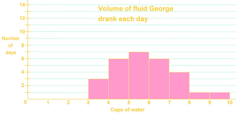
For how many days did George drink 2.0-2.9 cups of water?
Step 1: Understanding the Histogram
A histogram is a type of bar graph that represents the frequency of data within certain intervals or ranges. In this case, the histogram shows the volume of fluid George drank each day. The x-axis represents the intervals of cups of water consumed, while the y-axis represents the frequency, or the number of days George drank that amount of water.
Step 2: Identifying the Relevant Interval
To determine how many days George drank between 2.0 and 2.9 cups of water, we need to locate this interval on the x-axis of the histogram. The x-axis is divided into intervals, also known as buckets, which in this case represent ranges of cups of water consumed.
Step 3: Locating the Interval on the X-Axis
On the x-axis, find the interval that includes 2.0 to 2.9 cups of water. This interval is typically marked between the numbers 2 and 3 on the x-axis. This is the bucket we are interested in for this question.
Step 4: Checking the Frequency
Once the interval is located, we need to check the height of the bar corresponding to this interval. The height of the bar represents the frequency, or the number of days George drank between 2.0 and 2.9 cups of water. In this case, we observe that there is no bar (or the bar is at height zero) in the interval between 2.0 and 2.9 cups.
Step 5: Interpreting the Data
Since there is no bar present in the interval between 2.0 and 2.9 cups of water, it indicates that the frequency is zero. This means that George did not drink between 2.0 and 2.9 cups of water on any day.
Step 6: Conclusion
Based on the histogram, we can conclude that George drank between 2.0 and 2.9 cups of water on zero days. This is determined by observing the absence of a bar in the specified interval on the histogram.
FAQs
-
What is the difference between a histogram and a bar graph?
A histogram represents continuous data in adjacent bars, while a bar graph displays discrete categories with gaps between bars. Histograms show frequency distributions of data within intervals, whereas bar graphs compare distinct groups or categories.
-
How do I choose the right number of bins for a histogram?
The number of bins can be determined using various methods, such as the square root of the total data points or Sturges' formula. A general rule is to use enough bins to show the data's shape without introducing too much noise. Start with 5-20 bins and adjust based on your data's characteristics and the insights you want to highlight.
-
What can the shape of a histogram tell us about the data?
The shape of a histogram reveals important characteristics of the data distribution. A symmetrical shape suggests a normal distribution, while skewed shapes indicate more data on one side. Bimodal distributions (two peaks) suggest two subgroups within the data. The overall shape can indicate central tendency, spread, and potential outliers.
-
How do I interpret outliers in a histogram?
Outliers in a histogram appear as isolated bars far from the main distribution. They represent data points that are significantly different from the rest. While outliers can sometimes indicate errors, they may also reveal important extreme cases. Always investigate outliers to understand their cause and potential impact on your analysis.
-
Can histograms be used for comparing multiple datasets?
Yes, histograms are excellent for comparing multiple datasets. You can overlay histograms, use side-by-side comparisons, or create back-to-back histograms. When comparing, ensure consistent bin sizes and scales across all datasets. This allows for visual assessment of differences in central tendency, spread, and overall distribution shape between groups.
Prerequisite Topics
Understanding the foundation of a subject is crucial for mastering more complex concepts. When it comes to reading and drawing histograms, two key prerequisite topics play a vital role in building a solid understanding: the relationship between two variables and probability.
The concept of relationships between variables is fundamental to grasping histograms. Histograms are graphical representations that display the distribution of numerical data, showing how frequently different values occur within a dataset. By understanding how variables relate to each other, students can better interpret the information presented in histograms. This knowledge helps in identifying patterns, trends, and outliers within the data.
One key aspect of understanding variable relationships is recognizing the differences between histograms and bar graphs. While both are visual representations of data, they serve different purposes and are used in distinct contexts. Histograms are used for continuous data, whereas bar graphs are typically used for categorical data. This distinction is crucial when deciding which type of graph to use for a given dataset.
Probability, another essential prerequisite, forms the backbone of statistical analysis and is closely tied to histogram interpretation. When reading histograms, students often encounter concepts related to probability distributions. Understanding basic probability principles helps in making sense of the frequency distributions displayed in histograms. It allows students to make informed predictions and draw meaningful conclusions from the data presented.
A key skill in working with histograms is creating frequency tables, which is directly related to probability concepts. Frequency tables are often the first step in constructing histograms, as they organize raw data into manageable groups or intervals. This process requires an understanding of how to calculate probabilities and relative frequencies, which are fundamental probability concepts.
By mastering these prerequisite topics, students can approach histograms with confidence. They will be better equipped to interpret the shape of distributions, identify central tendencies, and understand the spread of data. This knowledge is not only crucial for academic success but also has practical applications in various fields, including science, economics, and data analysis.
In conclusion, a solid grasp of the relationship between variables and probability provides the necessary foundation for effectively reading and drawing histograms. These prerequisite topics enable students to understand the context, interpret the data accurately, and draw meaningful conclusions from histogram representations. As students progress in their studies, they will find that this foundational knowledge continues to be relevant and applicable in more advanced statistical concepts and data visualization techniques.