Pictographs
Topic Notes
In this lesson, we will learn:
- How to read a pictograph
- How to understand the symbols and scales for pictographs
- How to choose a scale when creating a pictograph
Notes:
- A pictograph is a graph that displays frequency data using picture symbols
- It is a great visual tool to show numbers in different categories from data collection experiments (i.e. surveys)
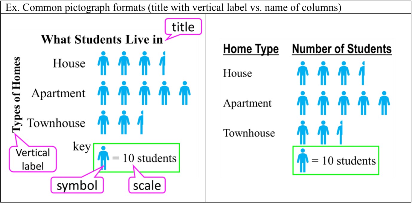
- The parts of a pictograph can include:
- a title to describe the data collected
- categories listed vertically (and sometimes, the category column names)
- (sometimes) a vertical label to describe the types of categories
- a key to show the symbol and scale (how much each symbol is worth)
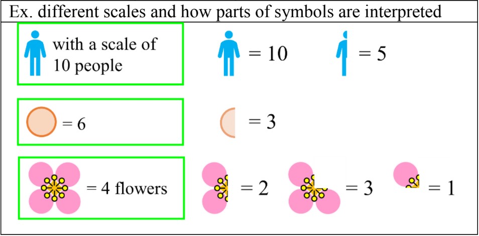
- Symbol scales can use whole symbols, half symbols, or even fractional symbols:
- To choose a scale for a data set, find a common factor for all the numbers (a number that can be multiplied into all the numbers of the data set). It is that more than one scale will work.
- Ex. a data set with a scale of 4 could also use a scale of 8 (doubled); the pictograph will look neater and use less symbols to represent numbers
Introduction to Pictographs
Pictographs are a visually engaging form of data representation that use simple pictures or symbols to convey information. These eye-catching charts play a crucial role in making complex data more accessible and understandable to a wide audience. In our introduction video, we'll explore the basics of pictographs and their significance in various fields, from education to business. This lesson will guide you through the essential skills of reading, interpreting, and creating pictographs effectively. You'll learn how to decipher the meaning behind different symbols, understand the scale and proportions used, and gain insights from the data presented. Additionally, we'll cover the step-by-step process of designing your own pictographs, enabling you to present information in a clear and visually appealing manner. By mastering pictographs, you'll enhance your ability to communicate data-driven stories and make informed decisions based on visual representations.
Understanding Pictographs: Definition and Components
Pictographs are powerful visual tools used to display frequency data using picture symbols. These eye-catching graphs provide an intuitive way to represent information, making them particularly useful for showing survey results and other data collection experiments. By utilizing familiar icons or symbols, pictographs can quickly convey complex data sets in a format that's easy for viewers to understand and interpret.
A well-designed pictograph consists of several key components that work together to present information clearly and effectively. Let's explore these essential elements:
- Title: The title of a pictograph succinctly describes the data being presented, giving viewers immediate context for the information they're about to examine.
- Categories: These are the different groups or classifications into which the data is organized. In a pictograph, categories are typically listed along one axis, often vertically.
- Vertical Label: This label identifies what the categories represent, providing additional clarity for the data's organization.
- Key: The key explains what each symbol in the pictograph represents. It's crucial for interpreting the data accurately, as it defines the value or quantity associated with each symbol.
- Symbol: Pictographs use recognizable symbols or icons to represent data points. These symbols are repeated to show frequency or quantity within each category.
- Scale: The scale in a pictograph indicates how many units or items each symbol represents. This information is vital for accurately interpreting the data presented.
The power of pictographs lies in their ability to make data more accessible and engaging. By using symbols that relate to the subject matter, these graphs can create an immediate connection with the viewer. For example, a pictograph about fruit consumption might use apple icons, while one about transportation could feature car symbols.
Pictographs are particularly effective for presenting survey results, as they can quickly show the distribution of responses across different categories. They excel at displaying comparative data, allowing viewers to easily see which categories have higher or lower frequencies. This visual approach is especially useful when communicating information to diverse audiences, including those who may not be familiar with more complex statistical representations.
When creating a pictograph, it's important to maintain consistency in symbol size and spacing to ensure accurate representation of the data. The scale should be chosen carefully to allow for clear differentiation between categories while still fitting all necessary information within the graph.
While pictographs are excellent for showing general trends and comparisons, they may not be suitable for presenting precise numerical data or handling very large data sets. In such cases, other types of graphs or charts might be more appropriate. However, for many applications in education, marketing, and public information campaigns, pictographs remain a valuable tool for data visualization.
In conclusion, pictographs offer a unique and engaging way to present frequency data using familiar symbols. By understanding and effectively utilizing the key components of pictographs - including the title, categories, vertical label, key, symbol, and scale - you can create compelling visual representations of survey results and other data collection experiments. These graphs not only make information more accessible but also help to capture and maintain audience attention, making them an invaluable asset in data communication.
Reading and Interpreting Pictographs
Pictographs are visual representations of data that use symbols or pictures to represent quantities. Learning how to read and interpret pictographs is an essential skill for understanding and analyzing data. In this guide, we'll walk you through the process using the example of a 'Movie Viewings This Year' pictograph.
Step 1: Understand the Key
Every pictograph has a key that explains what each symbol represents. In our example, let's say one movie reel symbol represents 5 movie viewings.
Step 2: Count Full Symbols
Start by counting the number of full symbols for each category. For instance, if John has 3 full movie reel symbols, that represents 15 movie viewings (3 x 5).
Step 3: Interpret Half Symbols
Pictographs often use half symbols to represent values that fall between multiples of the key value. A half symbol represents half of the key value. In our example, a half movie reel would represent 2.5 movie viewings.
Step 4: Calculate Total Values
To find the total value for each category, add the values represented by full and half symbols. For example, if Sarah has 2 full symbols and 1 half symbol, her total would be: (2 x 5) + (0.5 x 5) = 10 + 2.5 = 12.5 movie viewings.
Step 5: Compare Data
Once you've calculated the totals for each category, you can compare the data to answer questions about the information presented.
Practice Questions
Let's practice with our 'Movie Viewings This Year' pictograph:
- John: 3 full symbols
- Sarah: 2 full symbols, 1 half symbol
- Mike: 4 full symbols, 1 half symbol
- Emma: 1 full symbol, 1 half symbol
1. Who watched the most movies this year?
To answer this, calculate the total for each person:
John: 3 x 5 = 15 movies
Sarah: (2 x 5) + (0.5 x 5) = 12.5 movies
Mike: (4 x 5) + (0.5 x 5) = 22.5 movies
Emma: (1 x 5) + (0.5 x 5) = 7.5 movies
Mike watched the most movies with 22.5 viewings.
2. Who watched the least movies this year?
From our calculations, we can see that Emma watched the least movies with 7.5 viewings.
3. What is the difference between the number of movies watched by John and Sarah?
To find this, subtract Sarah's total from John's:
15 - 12.5 = 2.5 movies
4. How many more movies did Mike watch compared to Emma?
Subtract Emma's total from Mike's:
22.5 - 7.5 = 15 movies
Tips for Interpreting Pictographs
- Always check the key before interpreting the data
- Pay attention to half symbols and calculate their values accurately
- When comparing data, ensure you've calculated the total values correctly
- Look for patterns or trends in the data across categories
- Practice with various pictographs to improve your interpretation skills
By following
Understanding Symbols and Scales in Pictographs
Pictographs are visual representations of data that use symbols or icons to represent quantities. These symbols can be categorized into three main types: whole symbols, half symbols, and fractional symbols. Understanding how to interpret these symbols and their associated scales is crucial for accurately reading and creating pictographs.
Whole symbols are the most straightforward to interpret. Each complete symbol represents a specific value, typically determined by the scale of the pictograph. For example, if the scale states that one symbol equals 10 units, then each whole symbol in the graph represents 10 units of the measured quantity.
Half symbols are used to represent half of the value of a whole symbol. They are particularly useful when the data doesn't align perfectly with whole numbers of the chosen scale. For instance, if one whole symbol represents 10 units, a half symbol would represent 5 units. This allows for more precise representation of data that falls between multiples of the whole symbol value.
Fractional symbols take this concept further by representing portions of the whole symbol value smaller than one-half. These can include quarter symbols, third symbols, or any other fraction that helps accurately depict the data. Fractional symbols enable even greater precision in data representation, especially when dealing with small variations or when using a larger scale value per symbol.
The scale of a pictograph is crucial for interpreting the symbols correctly. It defines the value represented by each whole symbol. When reading a pictograph, always check the scale first to understand what each symbol represents. For example, a scale might state "1 symbol = 5 cars" or "1 symbol = 20 students". This information is essential for calculating the total value represented by the symbols in each category.
To calculate values based on the given scale, simply multiply the number of whole symbols by the scale value, then add any additional value represented by half or fractional symbols. For instance, if the scale is 1 symbol = 10 units, and you see 3 whole symbols and a half symbol, the total value would be (3 × 10) + (0.5 × 10) = 35 units.
Changing the scale can significantly affect the appearance and interpretation of a pictograph. A smaller scale value (e.g., 1 symbol = 5 units) will result in more symbols being used to represent the same data, potentially making the graph appear more cluttered but also more precise. Conversely, a larger scale value (e.g., 1 symbol = 50 units) will use fewer symbols, creating a cleaner look but potentially sacrificing some precision in the visual representation.
For example, consider a dataset showing book sales: 126 books for fiction, 84 for non-fiction, and 52 for children's books. With a scale of 1 symbol = 10 books, you would need 12.6 symbols for fiction, 8.4 for non-fiction, and 5.2 for children's books. This might be represented as 12 whole symbols and 1 half symbol for fiction, 8 whole symbols and 1 half symbol for non-fiction, and 5 whole symbols and 1 fifth symbol for children's books.
If we change the scale to 1 symbol = 25 books, the representation would change to 5 whole symbols for fiction (with a small fractional symbol for the remaining 1 book), 3 whole symbols and 1 third symbol for non-fiction, and 2 whole symbols for children's books (with a small fractional symbol for the remaining 2 books). This scale change results in fewer symbols overall but may make it slightly harder to visually distinguish small differences between categories.
Understanding the interplay between whole, half, and fractional symbols, as well as the impact of scale choice, is essential for both creating and interpreting pictographs effectively. By mastering these concepts, you can ensure that your data visualizations are both accurate and visually appealing, conveying information in a clear and engaging manner.
Choosing Scales for Pictographs
Selecting the right scale for a pictograph is crucial for creating clear and effective visual representations of data. This guide will walk you through the process of choosing appropriate scales, explain the concept of finding common factors in data sets, and demonstrate how different scales can be applied to the same information. We'll also explore the benefits of using larger scale factors and provide practice exercises to help you master this skill.
Understanding Scales in Pictographs
A scale in a pictograph determines how many units each symbol represents. Choosing the right scale is essential for creating a balanced and easily interpretable visual. The goal is to select a scale that allows for a neat presentation of data without overcrowding or oversimplifying the information.
Finding Common Factors in Data Sets
To choose an appropriate scale, start by identifying common factors in data sets. Common factors are numbers that divide evenly into multiple values in your data. For example, if your data set includes 12, 18, and 30, common factors could be 2, 3, or 6. These common factors can serve as potential scales for your pictograph.
Benefits of Larger Scale Factors
While smaller scale factors can work, using larger scale factors often results in neater, more compact pictographs. Larger scales reduce the number of symbols needed to represent each data point, making the visual less cluttered and easier to read at a glance. For instance, if you have data points of 50, 100, and 150, using a scale of 50 per symbol would create a much cleaner pictograph than a scale of 10 per symbol.
Examples of Scale Selection
Let's consider a data set representing the number of books read by different students: 12, 18, 24, and 30. Here are some possible scales:
- Scale of 1: This would require drawing up to 30 symbols, which could be time-consuming and cluttered.
- Scale of 3: This reduces the maximum number of symbols to 10, creating a more manageable pictograph.
- Scale of 6: This further simplifies the representation, with a maximum of 5 symbols needed.
In this case, a scale of 6 might be ideal, as it creates a compact pictograph while still allowing for clear differentiation between data points.
Adapting Scales for Different Data Ranges
When dealing with a wide range of values, consider using a larger scale to accommodate the highest numbers without making the lower values too small to represent. For example, if your data ranges from 10 to 1000, a scale of 100 per symbol might work well, allowing you to represent the largest value with 10 symbols while still being able to show the smallest value as a fraction of a symbol.
Creating Visually Appealing Pictographs
Remember that the goal of a pictograph is not just accuracy, but also visual appeal and ease of understanding. Choosing a scale that allows for whole or half symbols rather than complex fractions can make your pictograph more aesthetically pleasing and easier to interpret.
Practice Exercises
Try choosing appropriate scales for the following data sets:
- Monthly rainfall (in mm): 15, 30, 45, 60
- Number of cars sold: 120, 180, 240, 300
- Population of towns (in thousands): 5, 12, 18, 25
For each set, consider multiple scale options and think about which would create the most effective pictograph. Remember to look for common factors and consider the benefits of using larger scale factors for more compact representations.
Conclusion
Choosing the right scale for a pictograph is a balance between accuracy, clarity, and visual appeal. By finding common factors in your data set and considering the benefits
Creating Pictographs: Best Practices and Tips
Pictographs are powerful visual tools that use symbols or icons to represent data. When creating pictographs, it's crucial to follow best practices to ensure they're effective and easy to understand. This guide will help you create compelling pictographs that convey information clearly and engagingly.
Choosing appropriate symbols is the foundation of an effective pictograph. The symbols should directly relate to the data being represented. For instance, if you're illustrating car sales, use a car icon. The connection between the symbol and the data should be intuitive, allowing viewers to grasp the information quickly. Avoid using abstract or ambiguous symbols that might confuse your audience.
When designing pictographs, striking a balance between detail and clarity is essential. While detailed symbols can be visually appealing, they may distract from the data being presented. Opt for simple, clean designs that are easily recognizable at various sizes. Remember, the primary goal is to communicate information, not to showcase intricate artwork.
To make your pictographs visually appealing, consider using a consistent color scheme that complements your overall design or brand. Use contrasting colors to highlight important data points or trends. Ensure that the size of each symbol accurately represents the quantity it's meant to depict. Consistency in size and style across all symbols is key to maintaining a professional look.
Clarity is paramount in pictograph design. Use a legend or key to explain what each symbol represents and the value it holds. Keep the layout simple and organized, avoiding clutter that could confuse viewers. If representing fractional values, clearly show how partial symbols are used. Consider adding labels or numbers to provide additional context and precision.
When creating pictographs, be mindful of common pitfalls. Avoid using too many different symbols in one pictograph, as this can overwhelm viewers. Don't distort the scale to exaggerate differences; this can mislead your audience. Ensure that the total number of symbols accurately represents the data sum. Be cautious with 3D effects, as they can sometimes distort perception of quantity.
To enhance understanding, consider grouping symbols in a logical manner, such as by rows of ten. This makes it easier for viewers to count and comprehend larger quantities at a glance. If dealing with very large numbers, you might use one symbol to represent multiple units, clearly stating this in your legend.
Remember that accessibility is important. Choose colors that are distinguishable for color-blind individuals. Provide alternative text descriptions for digital pictographs to ensure they're accessible to screen readers. By following these guidelines, you'll create pictographs that are not only visually appealing but also effective in communicating data clearly and accurately to your audience.
Conclusion: Mastering Pictographs
In this lesson, we've explored the essential skills of reading, interpreting, and creating pictographs. We've learned how to analyze data represented by symbols, understand scale, and extract meaningful information from these visual representations. Mastering pictographs is crucial for effective data analysis and representation in various fields. To solidify your understanding, we encourage you to practice creating your own pictographs using real-world data sets. This hands-on experience will help you apply your new knowledge to practical situations. Remember the introduction video? Consider rewatching it to reinforce key concepts. By honing your pictograph skills, you'll enhance your ability to communicate complex information visually and make data-driven decisions. Keep practicing and exploring different data sets to become proficient in this valuable data visualization technique. With continued effort, you'll soon be able to master pictographs and elevate your data analysis capabilities.
Introduction to Pictographs: What is a pictograph?
Step 1: Understanding the Concept of a Pictograph
A pictograph is a graphical representation of data that uses visual symbols to represent frequency data. It is a tool used in data organization and analysis, making it a valuable addition to your math tool belt. The primary purpose of a pictograph is to visually display how often different categories or options appear in a dataset. This visual representation makes it easier to understand and interpret the data at a glance.
Step 2: Visual Representation of Frequency Data
Pictographs use symbols to represent data points, making the information more engaging and easier to comprehend. Each symbol in a pictograph corresponds to a specific quantity, which is usually indicated in a key or legend. This method of data representation is particularly effective because it is visually appealing and helps to quickly convey the frequency of each category within the dataset.
Step 3: Collecting Data for a Pictograph
The first step in creating a pictograph is to collect the necessary data. This data can come from various sources, such as surveys, questionnaires, or general observations. For example, you might conduct a survey in your classroom, at a local library, or within your community to gather information. The collected data will then be organized and used to create the pictograph.
Step 4: Components of a Pictograph
A typical pictograph consists of several key components:
- Title: The title of the pictograph indicates what the data represents. For example, it might show the types of homes students live in, such as houses, apartments, or townhouses.
- Vertical Label: This label, usually found on the side of the pictograph, categorizes the data. In our example, it would list the types of homes.
- Symbols: The symbols represent the data points. Each symbol corresponds to a specific quantity, as indicated by the key.
- Key: The key explains the value of each symbol. For instance, one symbol might represent ten students.
Step 5: Analyzing a Pictograph
Once the pictograph is created, the next step is to analyze it. This involves interpreting the visual data to understand the frequency of each category. For example, by looking at the pictograph, you can quickly determine how many students live in each type of home. This analysis helps to draw conclusions and make informed decisions based on the data.
Step 6: Variations of Pictographs
Pictographs can vary in their design and layout. While the basic components remain the same, the way the data is presented can differ. Some pictographs might not have a vertical label, and the information might be combined with the title. Additionally, the symbols and their arrangement can vary, providing different visual representations of the same data. Understanding these variations is important for accurately interpreting different pictographs.
Step 7: Practical Applications of Pictographs
Pictographs are used in various fields to present data in an easily understandable format. They are commonly used in education, business, and research to display survey results, demographic information, and other types of data. By using pictographs, complex data can be simplified, making it accessible to a wider audience.
Step 8: Creating Your Own Pictograph
To create your own pictograph, follow these steps:
- Collect the data you want to represent.
- Choose appropriate symbols to represent the data points.
- Create a key to explain the value of each symbol.
- Organize the data visually using the symbols.
- Add a title and any necessary labels to provide context.
FAQs
-
What is a pictograph and how is it different from other types of graphs?
A pictograph is a visual representation of data that uses symbols or icons to represent quantities. Unlike bar graphs or line charts, pictographs use relatable images to make data more engaging and easier to understand at a glance. Each symbol in a pictograph represents a specific quantity, making it particularly effective for displaying frequency data or survey results.
-
How do I interpret half symbols in a pictograph?
Half symbols in a pictograph represent half the value of a whole symbol. For example, if one whole symbol represents 10 units, a half symbol would represent 5 units. To calculate the total value, add the value of whole symbols and then add the value of any half symbols. This allows for more precise representation of data that doesn't align perfectly with the chosen scale.
-
What factors should I consider when choosing a scale for my pictograph?
When choosing a scale for your pictograph, consider the range of your data and look for common factors among the values. A good scale should allow for a neat presentation without overcrowding or oversimplifying the information. Larger scale factors often result in cleaner, more compact pictographs. Also, consider using a scale that allows for whole or half symbols rather than complex fractions for easier interpretation.
-
How can I make my pictographs more visually appealing and effective?
To create visually appealing and effective pictographs, use simple, recognizable symbols that relate directly to your data. Maintain consistency in symbol size and style, and use a complementary color scheme. Include a clear legend or key to explain what each symbol represents. Avoid clutter by using an organized layout and consider grouping symbols logically (e.g., in rows of ten) for easier counting. Ensure that your pictograph is accessible by choosing colors that are distinguishable for color-blind individuals.
-
What are some common mistakes to avoid when creating pictographs?
Common mistakes to avoid when creating pictographs include using too many different symbols in one graph, which can overwhelm viewers. Don't distort the scale to exaggerate differences, as this can mislead your audience. Ensure that the total number of symbols accurately represents the data sum. Be cautious with 3D effects, as they can sometimes distort the perception of quantity. Lastly, avoid using overly detailed or abstract symbols that might distract from or confuse the data being presented.
Prerequisite Topics
Before delving into the world of pictographs, it's crucial to understand the foundation upon which this visual representation of data is built. One of the most important prerequisite topics for mastering pictographs is influencing factors in data collection. This fundamental concept plays a significant role in shaping the accuracy and reliability of the information presented in pictographs.
Pictographs, also known as pictograms or icon charts, are a powerful tool for displaying quantitative information using pictures or symbols. They provide a visually appealing and easily understandable representation of data, making them popular in various fields, from education to business. However, the effectiveness of a pictograph heavily relies on the quality and integrity of the data it represents.
Understanding the influencing factors in data collection is essential because it directly impacts the creation and interpretation of pictographs. These factors can include sample size, data collection methods, potential biases, and environmental conditions. By grasping these concepts, students can better appreciate the importance of accurate data gathering and its influence on the final pictograph presentation.
For instance, if the data collection process is flawed or biased, the resulting pictograph may misrepresent the true nature of the information. This could lead to incorrect conclusions or misguided decision-making based on the visual representation. Therefore, a solid understanding of data collection principles ensures that students can critically evaluate the pictographs they encounter and create more reliable ones themselves.
Moreover, knowledge of data collection experiments helps students recognize the limitations and potential errors in pictographs. They can identify when a pictograph might be oversimplifying complex data or when it may be necessary to dig deeper into the underlying information. This critical thinking skill is invaluable in today's data-driven world, where visual representations of information are increasingly common.
By mastering the prerequisite topic of influencing factors in data collection, students lay a strong foundation for working with pictographs. They develop the ability to gather high-quality data, design effective pictographs, and interpret them accurately. This knowledge enhances their overall statistical literacy and prepares them for more advanced concepts in data visualization and analysis.
In conclusion, the journey to understanding pictographs begins with a solid grasp of data collection principles. By investing time in learning about influencing factors in data collection, students equip themselves with the necessary skills to create, interpret, and critically evaluate pictographs. This foundational knowledge not only enhances their ability to work with this specific type of data visualization but also contributes to their overall proficiency in statistics and data analysis.