TOPIC
MY PROGRESS
Pug Score
0%
Best Streak
0 in a row
Study Points
+0
Overview
Practice
Watch
Read
Quiz
Next Steps
Back to Menu
Topic Progress
Pug Score
0%
Videos Watched
0/0
Best Practice
No score
Read
Not viewed
Best Quiz
No attempts
Best Streak
0 in a row
Study Points
+0
Overview
Practice
Watch
Read
Quiz
Next Steps
Read
Understanding Bivariate Data and Scatter Plot Correlation
In this article, we've explored the fundamental concepts of bivariate data analysis, focusing on scatter plots and correlation. Understanding these elements is crucial for interpreting relationships between two variables. Scatter plots provide a visual representation of data points, allowing us to identify patterns and trends. Correlation measures the strength and direction of the relationship between variables. We've discussed positive, negative, and no correlation, as well as the importance of considering outliers and causation. To solidify your understanding, we encourage you to rewatch the introduction video, which offers a comprehensive overview of these concepts. By mastering bivariate data analysis, you'll enhance your ability to interpret and draw meaningful conclusions from various datasets. We invite you to explore further resources on this topic and apply these skills to real-world scenarios. Remember, practice is key to becoming proficient in data analysis!
Example:
Determining Correlation
For each of the following scatter plots determine whether the bivariate data is positively correlated, negatively correlated, or has no correlation.
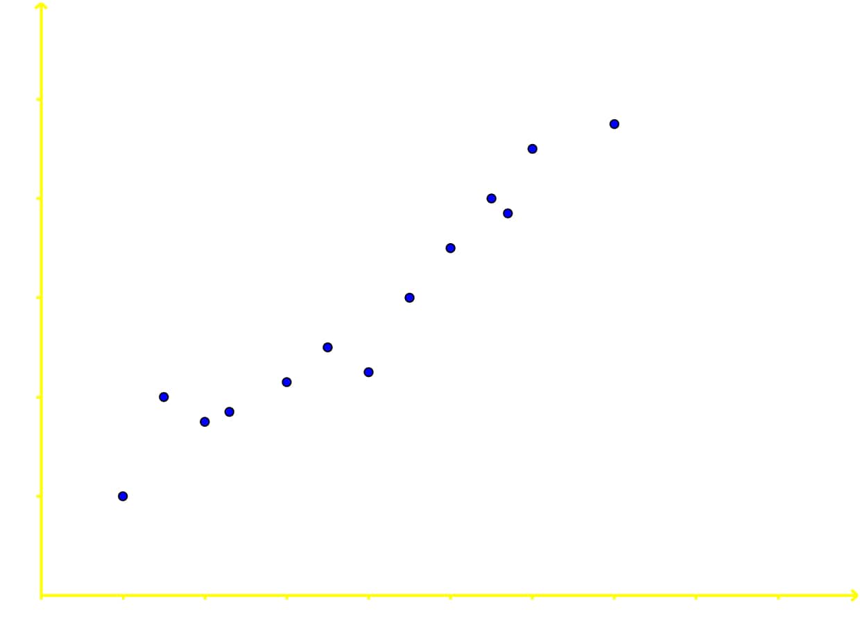
Step 1: Identify the Scatter Plot
The first step in determining the correlation of a scatter plot is to identify that it is indeed a scatter plot. A scatter plot is characterized by a collection of dots plotted on a graph, each representing a pair of values from two variables. The x-axis represents one variable, and the y-axis represents the other. In this example, we can see a scatter of dots on the graph, confirming that it is a scatter plot.
Step 2: Observe the General Trend of the Data Points
Next, observe the general trend of the data points. Look at how the dots are distributed across the graph. Are they forming a pattern that moves in a particular direction? In this scatter plot, we can see that the dots tend to move from the lower left to the upper right. This indicates a general upward trend.
Step 3: Draw an Imaginary Line
To better understand the trend, imagine drawing a line that best fits the data points. This line should be as close to all the data points as possible, without necessarily passing through each one. In this case, if we draw an imaginary line through the data points, it would slope upwards from left to right.
Step 4: Determine the Slope of the Line
The slope of the line is crucial in determining the type of correlation. If the line slopes upwards, it indicates a positive correlation. If it slopes downwards, it indicates a negative correlation. If the line is horizontal or there is no discernible pattern, it indicates no correlation. In this scatter plot, the line slopes upwards, suggesting a positive correlation.
Step 5: Interpret the Correlation
Based on the slope of the line, interpret the correlation. A positive slope means that as the value of the x-variable increases, the value of the y-variable also increases. This is known as a positive correlation. Conversely, a negative slope means that as the value of the x-variable increases, the value of the y-variable decreases, indicating a negative correlation. In this example, the upward slope of the line indicates a positive correlation.
Step 6: Consider the Strength of the Correlation
The strength of the correlation can also be considered. If the data points are very close to the line, the correlation is strong. If they are more spread out, the correlation is weaker. In this scatter plot, the data points are relatively close to the imaginary line, suggesting a strong positive correlation.
Step 7: Summarize the Findings
Finally, summarize your findings. In this example, the scatter plot shows a positive correlation. This means that as the value of the x-variable increases, the value of the y-variable also increases. The data points are relatively close to the imaginary line, indicating a strong positive correlation.
FAQs
Here are some frequently asked questions about bivariate data, scatter plots, and correlation:
1. What is a scatter plot and how does it show correlation?
A scatter plot is a graph that displays the relationship between two variables by plotting data points on a coordinate system. Each point represents a pair of values for the two variables. The pattern of these points can reveal the type and strength of correlation between the variables. For example, points forming a clear upward trend indicate a positive correlation, while points forming a downward trend suggest a negative correlation.
2. What does it mean when there is no correlation in a scatter plot?
When a scatter plot shows no correlation, it means there is no clear linear relationship between the two variables. The points on the graph appear randomly scattered without forming any discernible pattern. This suggests that changes in one variable do not consistently correspond to changes in the other variable.
3. How can you tell if a scatter plot has a strong or weak correlation?
The strength of correlation in a scatter plot is determined by how closely the points follow a clear pattern. A strong correlation is indicated by points that closely follow a straight line or a clear curve, with little deviation. A weak correlation is shown by points that follow a general trend but with significant scatter or deviation from the pattern. The tighter the clustering of points around a line or curve, the stronger the correlation.
4. What is an example of bivariate data?
An example of bivariate data is the relationship between a person's height and weight. Each data point would consist of two values: the height measurement and the corresponding weight measurement for an individual. Other examples include the relationship between study time and test scores, or the correlation between advertising expenditure and sales revenue.
5. How do you interpret a positive correlation in a scatter plot?
A positive correlation in a scatter plot is interpreted as a relationship where both variables tend to increase together. The points on the graph form a pattern that moves from the lower left to the upper right. This indicates that as the value of one variable increases, the value of the other variable tends to increase as well. The strength of the positive correlation is determined by how closely the points adhere to this upward trend.
Prerequisite Topics
Understanding the foundation of bivariate analysis, scatter plots, and correlation is crucial for students venturing into more advanced statistical concepts. Two key prerequisite topics play a vital role in grasping these concepts: the relationship between two variables and regression analysis.
The concept of the relationship between two variables forms the bedrock of bivariate analysis. This fundamental principle helps students comprehend how different factors interact and influence each other. By mastering this prerequisite, learners can more easily interpret scatter plots, which visually represent the relationship between two variables. Understanding how variables relate to one another is essential for identifying patterns, trends, and potential correlations in data sets.
Regression analysis, another crucial prerequisite, builds upon the understanding of variable relationships. This statistical method allows students to model and analyze the relationship between a dependent variable and one or more independent variables. Proficiency in regression analysis enables learners to quantify the strength and direction of relationships observed in scatter plots. It also provides a foundation for understanding correlation coefficients and their interpretation.
When students have a solid grasp of these prerequisite topics, they are better equipped to explore bivariate analysis, create and interpret scatter plots, and understand correlation. The relationship between variables concept helps in identifying which variables to plot on a scatter diagram, while regression analysis skills aid in determining the best-fit line and assessing the strength of correlations.
Moreover, these prerequisites are not isolated concepts but interconnected building blocks. The relationship between variables forms the basis for regression analysis, which in turn contributes to a deeper understanding of correlation. By mastering these foundational topics, students can more easily transition to advanced statistical techniques and data interpretation skills.
In conclusion, a strong foundation in the relationship between variables and regression analysis is indispensable for students approaching the study of bivariate analysis, scatter plots, and correlation. These prerequisites provide the necessary context and analytical tools to interpret data relationships effectively. By investing time in understanding these fundamental concepts, students set themselves up for success in more complex statistical analyses and data-driven decision-making processes.