Overview
Watch
Read
Next Steps
Read
Regression Analysis: Unveiling Data Relationships
In summary, regression analysis is a powerful tool for understanding relationships between variables in data. We've covered key points including simple linear regression, multiple regression, and logistic regression. These techniques allow us to model and predict outcomes, identify significant factors, and make data-driven decisions. It's crucial to practice these methods to gain proficiency and confidence in their application. As you become more comfortable with basic regression, consider exploring advanced topics like polynomial regression, ridge regression, or time series analysis. These will further enhance your analytical skills and broaden your data science toolkit. To reinforce your understanding, we encourage you to watch our introduction video, which provides a visual explanation of these concepts. By mastering regression analysis, you'll be well-equipped to tackle complex data problems and derive meaningful insights. Don't hesitate to dive deeper into this fascinating field of statistics and data science!
Example:
Interpolation and Extrapolation
A study took a sample of 14 cars and found the age of each car and the amount of money that each car is worth. A best fit line is given by the equation \(y=-2100x+27500\), where y is the worth of the car in dollars and \(x\) is the age of the car in years.
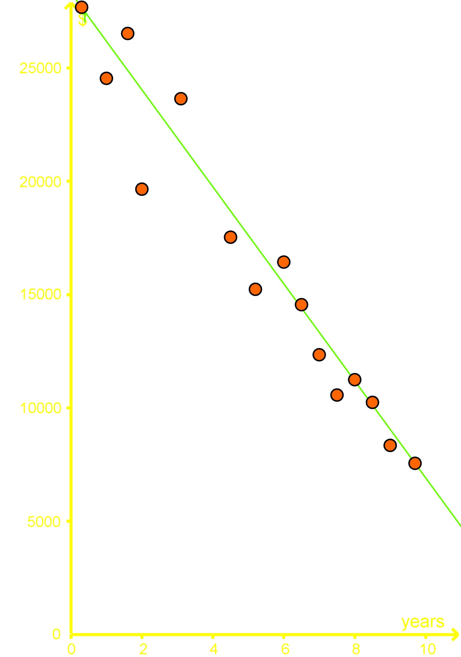
Using the best fit line interpolate what a car might be worth if it was 5 years old?
Step 1: Understanding the Best Fit Line
The best fit line is a linear equation that represents the relationship between the age of the car (x) and its worth in dollars (y). The equation given is \(y = -2100x + 27500\). Here, \(x\) is the age of the car in years, and \(y\) is the worth of the car in dollars. The slope of the line is -2100, which indicates that for each additional year of age, the car's worth decreases by $2100. The y-intercept is 27500, which represents the estimated worth of a brand new car (0 years old).
Step 2: Identifying the Given Data
The study took a sample of 14 cars, recording their ages and corresponding worths. The data points are plotted on a graph with the car's age on the x-axis and the car's worth on the y-axis. The best fit line is drawn through these points to represent the general trend of the data.
Step 3: Setting Up the Interpolation
Interpolation involves estimating a value within the range of the given data points. In this case, we need to estimate the worth of a car that is 5 years old using the best fit line equation. Since the data includes cars aged from 0 to 10 years, interpolating for a 5-year-old car falls within this range.
Step 4: Plugging in the Value
To find the worth of a 5-year-old car, we substitute \(x = 5\) into the best fit line equation. The equation becomes:
\(y = -2100(5) + 27500\)
Step 5: Performing the Calculation
Now, we perform the arithmetic to solve for \(y\):
\(y = -2100 \times 5 + 27500\)
\(y = -10500 + 27500\)
\(y = 17000\)
Step 6: Interpreting the Result
The result of the calculation indicates that, according to the best fit line, a car that is 5 years old is estimated to be worth $17,000. This value is derived from the linear relationship established by the regression analysis of the sample data.
Step 7: Validating the Estimate
It's important to remember that this estimate is based on the best fit line, which is a model that approximates the relationship between car age and worth. While it provides a reasonable estimate, actual car values can vary due to other factors not accounted for in this simple linear model.
FAQs
-
What is regression analysis?
Regression analysis is a statistical method used to examine the relationship between two or more variables. It helps in understanding how the value of a dependent variable changes when one or more independent variables are varied. This technique is widely used for prediction and forecasting.
-
What's the difference between interpolation and extrapolation?
Interpolation involves estimating values within the range of known data points, while extrapolation involves predicting values outside this range. Interpolation is generally more reliable as it's based on observed data, whereas extrapolation carries more risk as it assumes trends continue beyond the known data set.
-
How do I interpret the slope of a best fit line?
The slope of a best fit line represents the rate of change in the dependent variable for each unit change in the independent variable. A positive slope indicates a positive relationship (as one variable increases, so does the other), while a negative slope indicates an inverse relationship.
-
What are some limitations of simple linear regression?
Simple linear regression assumes a linear relationship between variables, which may not always reflect reality. It only considers one independent variable, potentially oversimplifying complex situations. It's also sensitive to outliers and assumes a cause-and-effect relationship, which may not always be true.
-
How can I improve my regression analysis skills?
To improve your regression analysis skills, practice with real-world datasets, learn to use statistical software, study advanced regression techniques like multiple regression and non-linear models, and stay updated with current research in the field. Additionally, focus on interpreting results in context and understanding the limitations of each method.
Prerequisite Topics for Regression Analysis
Understanding regression analysis is crucial in various fields, from economics to social sciences. However, to truly grasp this powerful statistical tool, it's essential to have a solid foundation in certain prerequisite topics. Two key areas that significantly contribute to mastering regression analysis are applications of linear relationships and the equation of the best fit line.
Firstly, a strong understanding of linear relationships is fundamental to regression analysis. When we explore linear relationships in real-world scenarios, we're essentially laying the groundwork for regression techniques. These applications help us visualize how variables can be related in a straightforward, linear manner. This concept is directly applicable in regression analysis, where we often start by assuming a linear relationship between variables before exploring more complex models.
The ability to interpret and apply linear relationships in various contexts prepares students to understand the basic principles of regression. It helps in recognizing patterns, making predictions, and understanding the limitations of linear models. This knowledge is invaluable when dealing with simple linear regression, which is often the starting point for more advanced regression techniques.
Equally important is the concept of the best fit line. This topic is at the heart of regression analysis. Understanding how to determine and interpret the equation of the best fit line is crucial for performing regression analysis effectively. The best fit line represents the relationship between variables that minimizes the overall difference between observed data points and the line itself.
Mastering best fit line estimation provides students with insights into how regression models are constructed. It introduces key concepts such as least squares estimation, which is fundamental in regression analysis. This knowledge helps in understanding how regression coefficients are calculated and interpreted, which is essential for conducting and interpreting regression analyses accurately.
By thoroughly grasping these prerequisite topics, students build a strong foundation for understanding regression analysis. The applications of linear relationships provide the conceptual framework, while the equation of the best fit line offers the practical tools needed to perform regression. Together, these topics enable students to approach regression analysis with confidence, understanding both its theoretical underpinnings and practical applications.
In conclusion, investing time in mastering these prerequisite topics is not just beneficial but essential for anyone looking to excel in regression analysis. They provide the necessary context and skills to navigate more complex statistical concepts and techniques, ensuring a comprehensive understanding of this vital statistical method.