Box-and-whisker plots and scatter plots
Topic Notes
Introduction
Box-and-whisker plots and scatter plots are essential statistical tools for data visualization and analysis. Box-and-whisker plots, also known as box plots, provide a concise summary of a dataset's distribution, displaying key statistics like median, quartiles, and outliers. Scatter plots, on the other hand, illustrate the relationship between two variables by plotting individual data points on a two-dimensional graph. The introduction video serves as a valuable resource for understanding these powerful visualization techniques. It demonstrates how to interpret and create both types of plots, highlighting their unique features and applications. By mastering these tools, analysts can quickly identify patterns, trends, and anomalies in complex datasets. Box-and-whisker plots excel at comparing distributions across multiple groups, while scatter plots are ideal for exploring correlations and identifying clusters. Together, these plots form a fundamental part of any data scientist's toolkit, enabling more informed decision-making and deeper insights into various phenomena across diverse fields of study.
Understanding Box-and-Whisker Plots
Box-and-whisker plots, also known as box plots, are powerful statistical tools used to visually represent the distribution of a dataset. These plots provide a concise summary of key statistical measures, making them invaluable for data analysis across various fields. To fully grasp the concept of box-and-whisker plots, it's essential to understand the key components and terms associated with them.
At the heart of a box-and-whisker plot are quartiles, which divide the dataset into four equal parts. The first quartile (Q1) represents the 25th percentile, the second quartile (Q2) is the median or 50th percentile, and the third quartile (Q3) is the 75th percentile. The median, a crucial measure of central tendency, separates the lower half of the dataset from the upper half.
The range of a dataset, another important concept, is the difference between the maximum and minimum values. In a box-and-whisker plot, the range is represented by the entire span of the plot, from the lowest to the highest point.
Interpreting a box-and-whisker plot involves examining its various components. The "box" in the plot represents the interquartile range (IQR), which is the range between Q1 and Q3. This box contains the middle 50% of the data and provides insight into the data's spread. The line within the box represents the median, offering a quick visual of the data's central value.
The "whiskers" extend from both ends of the box to the minimum and maximum values within a certain range, typically 1.5 times the IQR. These whiskers give information about the spread of data outside the central box. Any data points beyond the whiskers are considered outliers and are usually plotted as individual points.
To illustrate, consider a dataset of student test scores: 65, 70, 75, 78, 80, 81, 82, 85, 87, 88, 90, 92, 95. In a box-and-whisker plot of this data, the box would span from Q1 (75) to Q3 (88), with the median (82) marked inside. The whiskers would extend to the minimum (65) and maximum (95) scores, showing the full range of the data.
Box-and-whisker plots excel at showing the distribution of data. The position of the median within the box indicates skewness; if it's closer to Q1, the distribution is positively skewed, and if closer to Q3, it's negatively skewed. The length of the box and whiskers provides information about the data's spread and variability.
One of the key advantages of using box-and-whisker plots is their ability to display outliers clearly. Outliers, data points that fall significantly above or below the whiskers, are easily identifiable. This feature is particularly useful in fields like finance or quality control, where extreme values can have significant implications.
Another benefit of these plots is their efficiency in comparing multiple datasets side by side. By aligning several box plots, analysts can quickly compare distributions, medians, and ranges across different groups or categories. This makes box-and-whisker plots invaluable in fields like medical research, where comparing treatment outcomes across different patient groups is common.
Box-and-whisker plots also provide a comprehensive view of data without the need for underlying distributional assumptions. Unlike some other statistical methods that require normal distribution, box plots can effectively represent any type of data distribution, making them versatile tools in data analysis.
In conclusion, box-and-whisker plots are powerful visual tools for understanding data distribution. By clearly displaying quartiles, median, range, and outliers, they offer a wealth of information in a single, easy-to-interpret graph. Whether you're analyzing test scores, financial data, or scientific measurements, mastering the interpretation of box-and-whisker plots can significantly enhance your ability to draw meaningful insights from complex datasets. Their ability to succinctly represent key statistical measures makes them an indispensable tool in the data analyst's toolkit, providing a clear and comprehensive view of data distribution across various fields of study.
Creating a Box-and-Whisker Plot
A box-and-whisker plot, also known as a box plot, is a powerful statistical tool that provides a visual summary of data distribution. This step-by-step guide will walk you through the process of creating a box-and-whisker plot, emphasizing the importance of data ordering, median calculation, quartile determination, and plot construction.
Step 1: Data Ordering
The first crucial step in creating a box-and-whisker plot is to order your data from least to greatest. This process, known as data ordering, forms the foundation for all subsequent calculations. For example, let's use the dataset from the video: 2, 3, 5, 6, 7, 8, 9, 10, 11, 12. Ensure that every data point is accounted for and correctly positioned in ascending order.
Step 2: Median Calculation
Once your data is ordered, the next step is to calculate the median. The median is the middle value in your dataset. If you have an odd number of data points, the median is the middle number. For an even number of data points, take the average of the two middle numbers. In our example, with 10 data points, we have two middle numbers: 7 and 8. Therefore, the median is (7 + 8) / 2 = 7.5.
Step 3: Quartile Determination
Quartiles divide your dataset into four equal parts. To determine the quartiles:
- First Quartile (Q1): Find the median of the lower half of the data. In our example, the lower half is 2, 3, 5, 6, 7. The median of this subset is 5, so Q1 = 5.
- Third Quartile (Q3): Find the median of the upper half of the data. In our example, the upper half is 8, 9, 10, 11, 12. The median of this subset is 10, so Q3 = 10.
The second quartile (Q2) is the same as the median we calculated earlier, 7.5.
Step 4: Plot Construction
Now that we have our key values, we can construct the box-and-whisker plot:
- Draw a number line that encompasses your data range.
- Draw a box from Q1 to Q3. This box represents the middle 50% of your data.
- Draw a vertical line inside the box at the median (Q2).
- Draw the whiskers:
- The lower whisker extends from Q1 to the minimum value (2 in our example).
- The upper whisker extends from Q3 to the maximum value (12 in our example).
Step 5: Identifying Outliers (if applicable)
While our example doesn't include outliers, it's important to note that in some datasets, you may need to identify and represent outliers. Outliers are typically defined as data points that fall below Q1 - 1.5 * IQR or above Q3 + 1.5 * IQR, where IQR (Interquartile Range) is Q3 - Q1. Outliers are usually represented as individual points beyond the whiskers.
Importance of Accuracy
Accuracy in calculations and representation is paramount when creating a box-and-whisker plot. Even small errors in data ordering, median calculation, or quartile determination can lead to misrepresentation of your data distribution. Double-check each step of your process:
- Verify that your data is correctly ordered.
- Recheck your median and quartile calculations.
- Median position: The position of the median line within the box indicates skewness. If the median is closer to the bottom of the box, the data is positively skewed. If it's closer to the top, it's negatively skewed. A centered median suggests symmetrical data distribution.
- Box size: The size of the box represents the IQR and indicates the spread of the middle 50% of the data. A larger box suggests greater variability in the central portion of the dataset.
- Whisker length: The length of the whiskers shows the spread of the data outside the central 50%. Longer whiskers indicate a wider range of values and potentially more extreme data points.
- Outliers: Points plotted beyond the whiskers represent outliers, which are unusually high or low values compared to the rest of the dataset.
- A box plot with a small box, long upper whisker, and several high outliers might represent exam scores where most students scored within a narrow range, but a few exceptional students achieved much higher scores.
- A plot with a large box and short whiskers could indicate a dataset of housing prices in a diverse neighborhood, where there's a wide range of prices but few extreme values.
- A plot with a median line close to the bottom of the box and a long upper whisker might represent income distribution in a population, showing positive skewness typical of such data.
- Median comparison: Look at the relative positions of the median lines to compare central tendencies between datasets.
- Overlap: Check for overlap in the boxes and whiskers. Less overlap suggests more significant differences between datasets.
- Spread comparison: Compare the sizes of the boxes and lengths of the whiskers to assess relative variability between datasets.
- Outlier patterns: Note any differences in the number or distribution of outliers across the plots.
- Shape consistency: Look for similarities or differences in the overall shapes of the plots, which can indicate data spread in box plots.
- Collect your data: Gather two sets of related numerical data.
- Choose your axes: Decide which variable goes on the x-axis (horizontal) and which on the y-axis (vertical).
- Set up your graph: Draw perpendicular axes and label them with your chosen variables.
- Determine appropriate scales: Choose scales that accommodate your data range for both axes.
- Plot data points: For each data pair, locate the x-value on the horizontal axis and the y-value on the vertical axis. Mark the point where these values intersect.
- Add a title and legend: Clearly label your graph to provide context for viewers.
- Consider the range of your data and ensure your scales cover all values.
- Use consistent intervals for each axis to avoid distorting the visual representation.
- If dealing with vastly different scales, consider using logarithmic scales to better visualize the relationship.
- Extend your scales slightly beyond your data range to accommodate potential outliers.
- Linear: Points form a straight line, indicating a strong relationship.
- Curved: Points follow a curved path, suggesting a non-linear relationship.
- Clustered: Points group together in certain areas, hinting at subgroups within your data.
- Random: No discernible pattern, suggesting little to no relationship between variables.
- Positive correlation: As one variable increases, the other tends to increase.
- Negative correlation: As one variable increases, the other tends to decrease.
- No correlation: No clear relationship between the variables.
- Minimum Value: The smallest data point, represented by the leftmost point of the left whisker.
- First Quartile (Q1): The median of the lower half of the data set, marking the left edge of the box.
- Median (Q2): The middle value of the data set, represented by the line inside the box.
- Third Quartile (Q3): The median of the upper half of the data set, marking the right edge of the box.
- Maximum Value: The largest data point, represented by the rightmost point of the right whisker.
- The box represents the cat's nose.
- The line inside the box is the middle of the cat's nose.
- The whiskers extending from the box are the cat's whiskers.
- Identify the right whisker of the plot.
- Locate the far right tip of the right whisker.
- Read the value directly below this point on the horizontal axis.
-
What is the main difference between box-and-whisker plots and scatter plots?
Box-and-whisker plots summarize the distribution of a single dataset, showing median, quartiles, and potential outliers. Scatter plots, on the other hand, display the relationship between two variables by plotting individual data points on a two-dimensional graph. Box plots are ideal for comparing distributions across groups, while scatter plots excel at revealing correlations and patterns between two variables.
-
How do I interpret outliers in a box-and-whisker plot?
Outliers in a box-and-whisker plot are typically represented as individual points beyond the whiskers. They are data points that fall below Q1 - 1.5 * IQR or above Q3 + 1.5 * IQR, where IQR is the interquartile range. These points indicate unusual values in the dataset that may warrant further investigation or could potentially influence statistical analyses.
-
Can scatter plots show more than two variables?
While basic scatter plots display two variables, they can be modified to show additional variables. Color coding points can introduce a third variable, and varying point sizes can represent a fourth. These modifications transform the plot into a multi-dimensional visualization, allowing for more complex data representation and analysis.
-
What does the shape of a box-and-whisker plot tell us about data distribution?
The shape of a box-and-whisker plot provides insights into data distribution. A symmetrical box with the median line in the center suggests a normal distribution. If the median line is closer to one end of the box, it indicates skewness. The length of the box (IQR) and whiskers show the data's spread, with longer elements indicating greater variability.
-
How can I determine if there's a correlation in a scatter plot?
To determine correlation in a scatter plot, observe the overall pattern of points. A positive correlation is indicated by points trending upward from left to right, while a negative correlation shows points trending downward. The strength of the correlation is reflected in how closely the points follow a linear pattern. No clear trend suggests little to no correlation between the variables.
Interpreting Box-and-Whisker Plots
Box-and-whisker plots, also known as box plots, are powerful tools for data interpretation that provide a concise visual summary of a dataset's distribution. Understanding how to effectively interpret these plots is crucial for anyone working with data analysis or statistics. This guide will explore the key aspects of box-and-whisker plots, including what different shapes and sizes indicate about data distribution, concepts like skewness, spread, and clustering, and tips for comparing multiple plots.
The structure of a box-and-whisker plot consists of a box representing the interquartile range (IQR), a line within the box showing the median, and whiskers extending to the minimum and maximum values (excluding outliers). The lower edge of the box represents the first quartile (Q1), while the upper edge represents the third quartile (Q3).
When interpreting box plots, pay attention to the following key features:
Understanding skewness is crucial in data interpretation. A symmetrical distribution will have a box plot with roughly equal-sized halves on either side of the median. Positively skewed data will have a longer whisker or more outliers on the upper end, while negatively skewed data will show this pattern on the lower end.
Data spread in box plots is another important concept in box plot interpretation. A narrow box with short whiskers indicates tightly clustered data with little variability. Conversely, a wide box with long whiskers suggests a dataset with significant spread and variability.
Clustering of data can also be inferred from box plots. If the box is small relative to the whiskers, it suggests that a large portion of the data is concentrated around the median, with fewer values in the extremes. Multiple clusters in a dataset might be indicated by an unusually wide box or by the presence of many outliers.
Let's consider some examples of box plots and what they reveal:
When comparing multiple box plots, consider the following tips:
Introduction to Scatter Plots
Scatter plots are another essential tool in the data visualization toolkit, offering unique insights into the relationships between variables. Unlike box-and-whisker plots, which primarily show the distribution of a single variable, scatter plots excel at displaying how two variables interact with each other. This makes them invaluable for identifying patterns, trends, and correlations within datasets.
At its core, a scatter plot consists of individual data points plotted on a two-dimensional graph. Each point represents a single observation, with its position determined by the values of two variables. The horizontal x-axis typically represents the independent variable, while the vertical y-axis represents the dependent variable. This simple yet powerful arrangement allows viewers to quickly grasp the nature of the relationships between variables.
The components of a scatter plot are straightforward but highly informative. The axes provide the scale and context for the data, often starting at zero but not always, depending on the data range. The data points themselves are the stars of the show, with their distribution telling a story about the dataset. Trends can be visually identified by the overall pattern of the points whether they cluster tightly, spread out, or form distinct shapes.
One of the key strengths of scatter plots is their ability to reveal different types of relationships. A positive correlation is indicated when the points trend upward from left to right, suggesting that as one variable increases, so does the other. Conversely, a negative correlation is shown by points trending downward, indicating that as one variable increases, the other decreases. No clear trend might suggest that there's no significant relationship between the variables.
Scatter plots are particularly useful when dealing with continuous variables, making them ideal for scientific and statistical analysis. They're commonly employed in fields such as economics, biology, and social sciences to explore relationships between factors like income and education, height and weight, or temperature and plant growth. The visual nature of scatter plots makes complex relationships accessible, allowing researchers and analysts to spot patterns that might be missed in raw data or summary statistics.
When deciding whether to use a scatter plot, consider the nature of your data and your analytical goals. Scatter plots are most effective when you're trying to: 1. Identify correlations between two variables 2. Detect outliers or unusual patterns in the data 3. Determine if there's a linear or non-linear relationship 4. Visualize the strength of a relationship between variables
The advantages of scatter plots in showing relationships between variables are numerous. They provide a clear visual representation of data distribution, making it easy to spot trends at a glance. This visual approach can reveal insights that might be obscured in numerical data alone. Scatter plots also excel at highlighting outliers data points that don't conform to the overall pattern which can be crucial for identifying errors or exceptional cases in your dataset.
Moreover, scatter plots can be enhanced with additional features to convey even more information. Color coding can be used to introduce a third variable, turning the plot into a three-dimensional representation. Trend lines or curves can be added to emphasize the overall pattern, making it easier to interpret the relationship between variables. The size of the data points can also be varied to represent a fourth variable, further increasing the plot's information density.
While scatter plots are powerful, it's important to be aware of their limitations. They work best with continuous variables and may not be suitable for categorical variables. Additionally, when dealing with large datasets, overlapping points can obscure patterns, a problem known as overplotting. Techniques like transparency or jittering can help mitigate this issue, ensuring that the full story of the data remains visible.
In conclusion, scatter plots are an indispensable tool for data visualization, offering a unique perspective on variable relationships and trend visualization. Their ability to clearly display correlations, outliers, and patterns makes them invaluable across various fields of study and analysis. By understanding when and how to use scatter plots effectively, data analysts and researchers can unlock deeper insights from their datasets, leading to more informed decisions and discoveries.
Creating and Interpreting Scatter Plots
Scatter plots are powerful data visualization tools that help us understand relationships between two variables. In this guide, we'll explore how to create a scatter plot, plot data points effectively, choose appropriate scales for axes, and interpret the results. We'll also discuss how to identify patterns, correlations, and outliers in scatter plots.
Creating a Scatter Plot
To create a scatter plot, follow these steps:
Choosing Appropriate Scales
Selecting the right scales for your axes is crucial for accurate data plotting and interpretation:
Interpreting Scatter Plots
Once you've created your scatter plot, it's time to analyze the data. Here's what to look for:
1. Identifying Patterns
Observe the overall shape and distribution of points. Common patterns include:
2. Analyzing Correlations
Correlations indicate how strongly two variables are related. In scatter plots, we can observe:
3. Detecting Outliers
Outliers are data points that significantly deviate from the overall pattern. They may represent errors, unusual cases, or important exceptions in your data. Look for points that are far removed from the main cluster of data.
Examples of Relationships in Scatter Plots
Let's explore some examples to illustrate different types of relationships:
1. Positive Correlation
Example: A scatter plot of study time vs. test scores might show a positive correlation. As study time increases, test scores tend to increase as well. The points would generally trend from the lower left to the upper right of the graph.
2. Negative Correlation
Example: A scatter plot of car age vs. resale value might display a negative correlation. As a car's age increases, its resale value typically decreases. The points would trend from the upper left to the lower right of the graph.
3. No Correlation
Comparing Box-and-Whisker Plots and Scatter Plots
In the realm of data visualization, box-and-whisker plots and scatter plots are two powerful tools that serve distinct purposes in data analysis. Understanding their strengths, limitations, and appropriate use cases is crucial for effective data interpretation strategies.
Box-and-whisker plots, also known as box plots, excel at displaying the distribution of a dataset. They provide a concise summary of key statistical measures, including the median, quartiles, and potential outliers. This makes them particularly useful for comparing distributions across different groups or categories. The "box" represents the interquartile range, while the "whiskers" extend to show the full range of the data, excluding outliers.
On the other hand, scatter plots are ideal for visualizing relationships between variables. They display individual data points on a two-dimensional plane, allowing analysts to identify patterns, trends, and correlations. Scatter plots are excellent for detecting linear or non-linear relationships and can reveal clusters or gaps in the data.
When it comes to strengths, box plots offer a quick overview of data distribution, making it easy to compare multiple datasets side by side. They're particularly effective in identifying skewness and the presence of outliers. Scatter plots, meanwhile, excel in showing the exact values of individual data points and their relationships between variables, which is crucial for correlation analysis.
However, both plot types have limitations. Box plots summarize data, potentially obscuring important details about the underlying distribution. They also don't show the exact number of data points. Scatter plots, while detailed, can become cluttered with large datasets and may not effectively represent overlapping points.
Choosing between these plots depends on the specific analysis task. Box plots are preferred when comparing distributions across groups or when summarizing large datasets succinctly. They're particularly useful in fields like healthcare for comparing patient outcomes across different treatments. Scatter plots are the go-to choice for examining relationships between variables, such as in economic studies looking at the correlation between income and education levels.
Interestingly, these plots can be used together for complementary analysis. For instance, in a study of student performance, a box plot could show the distribution of test scores across different schools, while a scatter plot could reveal the relationship between study hours and test scores. This combination provides a more comprehensive understanding of the dataset, offering both summary statistics and detailed individual data points.
The importance of selecting the right visualization tool cannot be overstated in data analysis. The choice between box-and-whisker plots and scatter plots, or their combined use, significantly impacts how data is interpreted and understood. By carefully considering the nature of the data and the questions being asked, analysts can leverage these tools to uncover valuable insights and communicate findings effectively.
Conclusion
Box-and-whisker plots and scatter plots are essential tools in data visualization. Box plots provide a concise summary of data distribution, showing median, quartiles, and potential outliers. They're particularly useful for comparing multiple datasets side by side. Scatter plots, on the other hand, excel at revealing relationships between variables, allowing us to identify patterns, trends, and correlations. The introduction video plays a crucial role in enhancing understanding of these plot types. It offers a visual demonstration of how to construct and interpret these graphs, making abstract concepts more tangible. By watching the video, viewers can grasp the practical applications of box-and-whisker plots and scatter plots in real-world scenarios. This visual learning approach reinforces key concepts, helping students and professionals alike to better analyze and present data effectively. The video serves as a foundation for further exploration and application of these powerful data visualization techniques.
Box-and-Whisker Plot Analysis:
A box-and-whisker plot is shown below.
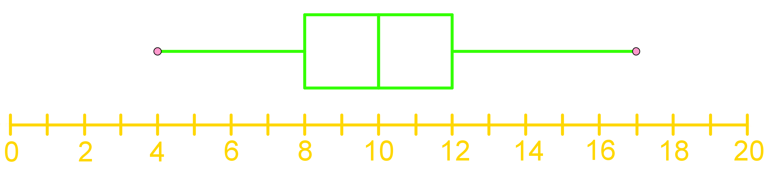
What is the maximum value?
Step 1: Understanding the Box-and-Whisker Plot
A box-and-whisker plot is a graphical representation used to display the distribution of a data set. It shows how data is spread out and provides a visual summary of the data's minimum, first quartile, median, third quartile, and maximum values. The plot consists of a box, which represents the interquartile range (IQR), and "whiskers" that extend to the minimum and maximum values.
Step 2: Identifying Key Components
To interpret a box-and-whisker plot, it's essential to identify its key components:
Step 3: Visualizing the Plot as a Cat's Face
To make it easier to understand, imagine the box-and-whisker plot as the face of a cat:
Step 4: Locating the Maximum Value
The maximum value in a box-and-whisker plot is found at the far right tip of the right whisker. This point represents the highest data point in the data set. To determine the maximum value, follow these steps:
Step 5: Interpreting the Maximum Value
In the given box-and-whisker plot, the maximum value is located at the far right tip of the right whisker. By examining the plot, we can see that this point falls between 16 and 18 on the horizontal axis. Therefore, the maximum value is 17.
FAQs
Prerequisite Topics
Understanding the foundation of statistical concepts is crucial when delving into more advanced topics like box-and-whisker plots and scatter plots. One essential prerequisite topic that plays a significant role in comprehending these graphical representations is Z-scores and random continuous variables. This fundamental concept serves as a building block for analyzing and interpreting data distributions, which is at the core of both box-and-whisker plots and scatter plots.
Z-scores, also known as standard scores, provide a standardized way to measure how far a data point is from the mean in terms of standard deviations. This concept is particularly relevant when working with box-and-whisker plots, as these plots visually represent the distribution of data, including measures of central tendency and spread. By understanding z-scores, students can better interpret the position of data points within the quartiles of a box plot and identify potential outliers.
Moreover, the concept of random continuous variables is fundamental to both box-and-whisker plots and scatter plots. Continuous variables can take on any value within a given range, which is often the type of data represented in these graphical formats. For instance, in a scatter plot, both the x and y axes typically represent continuous variables, allowing for the visualization of relationships between two variables across a continuous spectrum.
When students have a solid grasp of continuous variables analysis, they can more effectively interpret the patterns and trends displayed in scatter plots. This understanding helps in identifying correlations, clusters, or outliers within the data set. Similarly, for box-and-whisker plots, comprehending continuous variables aids in understanding the distribution of data across quartiles and the significance of the median and interquartile range.
Furthermore, the knowledge of z-scores becomes particularly useful when comparing data sets or identifying unusual values in both types of plots. In scatter plots, z-scores can help in standardizing variables on different scales, making comparisons more meaningful. For box-and-whisker plots, understanding z-scores aids in determining how extreme the whiskers or individual data points are relative to the overall distribution.
By mastering the concepts of Z-scores and random continuous variables, students lay a strong foundation for working with box-and-whisker plots and scatter plots. This prerequisite knowledge enhances their ability to create, interpret, and draw meaningful conclusions from these graphical representations. It also prepares them for more advanced statistical analyses and data visualization techniques, making the journey through statistics more coherent and interconnected.
In conclusion, the importance of understanding prerequisite topics like z-scores and random continuous variables cannot be overstated when studying box-and-whisker plots and scatter plots. These fundamental concepts provide the necessary context and analytical tools to fully appreciate and utilize these powerful data visualization methods in various fields of study and real-world applications.