TOPIC
MY PROGRESS
Pug Score
0%
Best Streak
0 in a row
Study Points
+0
Overview
Practice
Watch
Read
Quiz
Next Steps
Get Started
Get unlimited access to all videos, practice problems, and study tools.
Back to Menu
Topic Progress
Pug Score
0%
Videos Watched
0/0
Best Practice
No score
Read
Not viewed
Best Quiz
No attempts
Best Streak
0 in a row
Study Points
+0
Overview
Practice
Watch
Read
Quiz
Next Steps
Read
Circle Graphs: Mastering Data Interpretation and Creation
Circle graphs are also known as pie charts. In this section, we are asked to interpret and create circle graphs. When interpreting the graphs, we are asked to determine the number of people represented by given percentages in our graphs. Also, we are asked to interpret tables of data and fill in these tables by converting between fractions, percentages and decimal numbers. Finally, we are asked to draw circle graphs to display data given in these tables.
In this article, we've explored the essential aspects of circle graphs, focusing on how to interpret and create them effectively. The introduction video provided a crucial foundation for understanding these visual representations of data. We've learned that circle graphs, also known as pie charts, are excellent tools for displaying proportional relationships within a whole. Key points covered include reading percentages, comparing segments, and identifying the largest and smallest categories. When creating circle graphs, we emphasized the importance of accurate calculations and clear labeling. To truly master this skill, practice is vital. We encourage you to work with various datasets, creating and interpreting circle graphs on your own. For further engagement, try solving sample problems or explore related topics such as bar graphs or line charts. By honing your skills with circle graphs, you'll enhance your ability to analyze and present data effectively in various academic and professional contexts.
Circle Graphs: Analyzing Student Activities
The circle graph shows the types of activities that 200 students participated in during the school year.
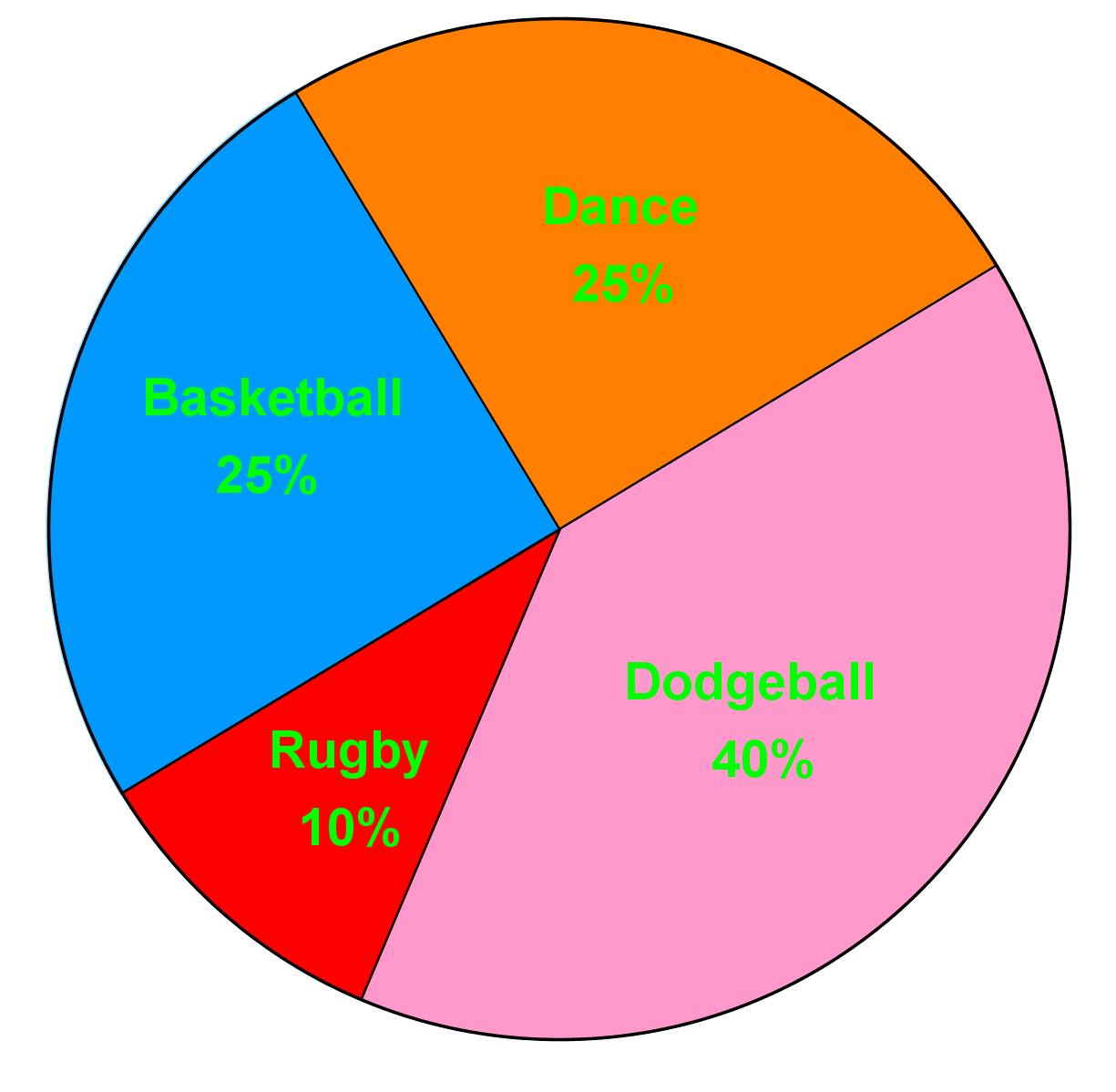
What is the least popular activity?
Step 1: Understanding the Circle Graph
To begin with, it's essential to understand what a circle graph (or pie chart) represents. A circle graph is a circular chart divided into sectors, each sector representing a proportion of the whole. In this case, the circle graph shows the types of activities that 200 students participated in during the school year. Each sector of the circle graph is labeled with an activity and a percentage that indicates the proportion of students who participated in that activity.
Step 2: Identifying the Question
The question asks us to determine the least popular activity among the students. This means we need to find the activity that the smallest percentage of students participated in. In other words, we are looking for the smallest sector in the circle graph.
Step 3: Analyzing the Sectors
To find the least popular activity, we need to carefully examine each sector of the circle graph. Each sector is represented by a different color and labeled with the activity and its corresponding percentage. By comparing the sizes of the sectors, we can identify which one is the smallest.
Step 4: Comparing Percentages
Next, we compare the percentages of each activity. The activity with the smallest percentage is the least popular. In the provided circle graph, the activities and their percentages are as follows:
- Basketball: 25%
- Soccer: 25%
- Swimming: 40%
- Rugby: 10%
Step 5: Verifying the Smallest Sector
To ensure accuracy, we should verify that the sector representing rugby is indeed the smallest. Visually inspect the circle graph to confirm that the sector for rugby is smaller than the sectors for basketball, soccer, and swimming. This visual confirmation supports our conclusion based on the percentages.
Step 6: Drawing the Conclusion
After analyzing the circle graph and comparing the percentages, we can conclude that the least popular activity among the students is rugby, as it has the smallest sector and the lowest percentage (10%). This step-by-step approach ensures that we accurately identify the least popular activity based on the data presented in the circle graph.
FAQs
Here are some frequently asked questions about circle graphs:
1. What are the different types of circular graphs?
The main types of circular graphs include pie charts, doughnut charts, sunburst charts, and polar area diagrams. Each type serves different purposes in data visualization, with pie charts being the most common for showing proportions of a whole.
2. How do you describe a circle on a graph?
A circle on a graph is described by its center point (h, k) and its radius r. The equation of a circle is (x - h)² + (y - k)² = r², where (x, y) represents any point on the circle's circumference.
3. What does the circle graph tell us?
A circle graph, or pie chart, tells us the proportional relationship between parts of a whole. It visually represents how different categories contribute to the total, making it easy to compare relative sizes of various segments.
4. How do you represent data in a circle graph?
To represent data in a circle graph, convert each category's value to a percentage of the total. Then, multiply each percentage by 360° to determine the angle for each sector. Draw these sectors in the circle, with the size of each slice proportional to its percentage.
5. What are the rules for the graph of a circle?
The rules for graphing a circle include: 1) Identify the center point (h, k), 2) Determine the radius r, 3) Plot points r units away from the center in all directions, 4) Connect these points to form a smooth circular shape. The circle should be symmetrical about its center point.
Prerequisite Topics
Understanding the foundational concepts that lead to mastering circle graphs is crucial for students aiming to excel in data visualization and statistical analysis. One of the most important prerequisite topics for circle graphs is using the sine ratio to calculate angles and sides. This fundamental trigonometric concept plays a pivotal role in constructing and interpreting circle graphs accurately.
Circle graphs, also known as pie charts, are visual representations of data that divide a circle into sectors, with each sector's size proportional to the quantity it represents. The ability to calculate sector angles is essential for creating these graphs, and this is where trigonometry, specifically the sine ratio, comes into play.
When working with circle graphs, students need to understand how to convert percentages or fractions of data into angles. This process involves calculating sector angles using trigonometric principles. The sine ratio, expressed as Sin = opposite / hypotenuse, is a fundamental tool in this calculation.
By mastering the use of the sine ratio, students can accurately determine the central angle of each sector in a circle graph. This skill is crucial because the precision of these angles directly affects the visual representation of the data. Inaccurate calculations can lead to misrepresentation of information and potentially flawed analysis.
Moreover, understanding the sine ratio and its application in calculating angles provides students with a deeper insight into the geometric principles underlying circle graphs. This knowledge enhances their ability to interpret and analyze data presented in this format, a skill that is invaluable in various fields such as statistics, economics, and social sciences.
The connection between trigonometry and circle graphs extends beyond mere calculations. It fosters a holistic understanding of mathematical concepts and their real-world applications. Students who grasp the relationship between sine ratios and sector angles are better equipped to tackle more complex data visualization challenges and to critically analyze information presented in circular formats.
In conclusion, the importance of understanding prerequisite topics like using the sine ratio to calculate angles and sides cannot be overstated when it comes to mastering circle graphs. This foundational knowledge not only enables students to create accurate and meaningful visual representations of data but also enhances their overall mathematical reasoning and analytical skills. As students progress in their studies and careers, the ability to work confidently with circle graphs, grounded in a solid understanding of trigonometric principles, will prove to be an invaluable asset.