Box-and-whisker plots and scatter plots

All You Need in One Place

Everything you need for Year 6 maths and science through to Year 13 and beyond.

Learn with Confidence

We’ve mastered the national curriculum to help you secure merit and excellence marks.

Unlimited Help

The best tips, tricks, walkthroughs, and practice questions available.

0/2
?
Intros
Lessons
  1. Introduction to box-and-whisker plots
  2. How to read box-and-whisker plots?
  3. How to draw a box-and-whisker plot?
0/16
?
Examples
Lessons
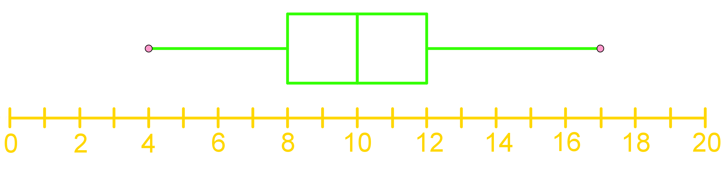
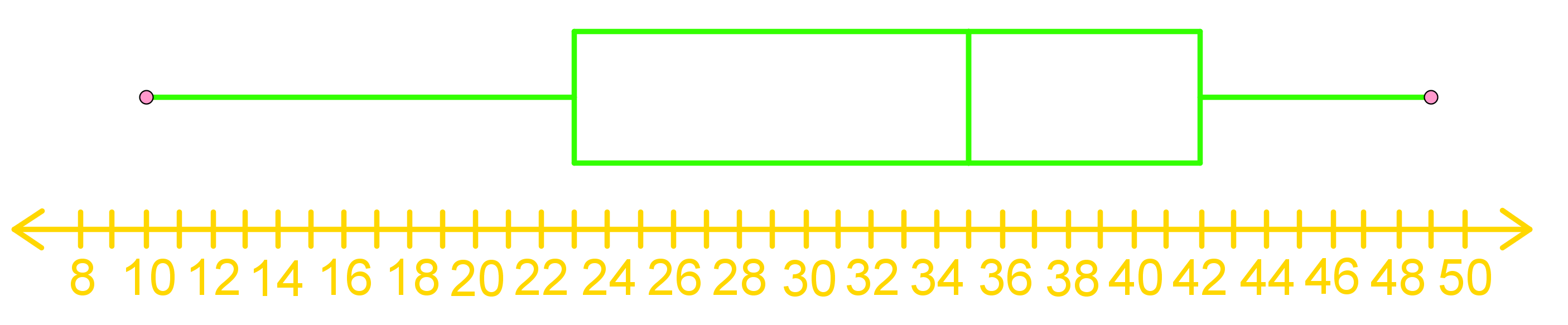
  1. A box-and-whisker plot is shown below.
    Box-and-whisker plots
    1. What is the maximum value?
    2. What is the median of the entire set?
    3. What are the upper and lower quartiles?
    4. Find the interquartile range (IQR) of the data.
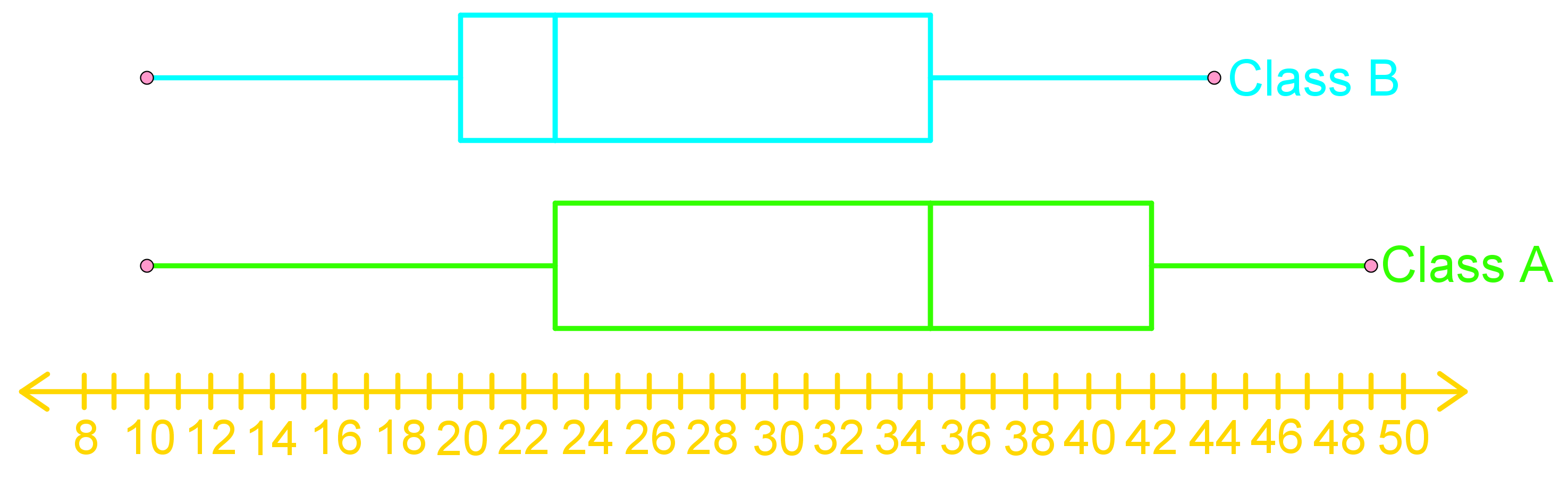
  2. Below is a box-and-whisker plot showing the scores that students from Class A got on the last math test. There are 19 students in the class.
    Box-and-whisker plots
    1. How many students had scores below 23?
    2. How many of the students got a score of 42 or higher?
    3. How many of them got a score between 35 and 42 (including 35 and 42)?
    4. Class B has 19 students and did the same test as class A. The results for class B are shown below. Which class did better on average?
      Comparing Box-and-whisker plots
  3. The data below represents the number of books each student in a book club read over one year.
    13, 25, 16, 21, 16, 23, 18, 20, 20
    1. Draw a box-and-whisker plot for the data.
    2. What percent of the club has read 16 to 20 books?
    3. How many of the students read 21 books or more?
    4. What does the length of the plot tell you about the data?
  4. A number of people were surveyed to study the relationship between the number of hours of exercise a person gets per week and the number of calories they consume. The data was recorded in the scatterplot below.
    Scatter plots
    1. According to the scatterplot, how many hours of exercise per week are done by an individual who consumes 14700 calories?
    2. Draw a line of best fit through the data.
    3. Determine if there is a trend in the data and, if so, describe the relationship.
  5. Use a scatterplot to show the time students spent on studying for a quiz and their scores. Then, describe the relationship.

    Study time (hours/week)

    Score (%)

    16

    96

    14

    93

    12

    89

    10

    86

    8

    81

    6

    72

    4

    65

    2

    60

    Topic Notes
    ?